![logo_white_booster-Sep-13-2022-06-54-02-62-PM.png]](https://help.boostertheme.com/hs-fs/hubfs/logo_white_booster-Sep-13-2022-06-54-02-62-PM.png?height=36&name=logo_white_booster-Sep-13-2022-06-54-02-62-PM.png)
Product pages are the lifeblood of any successful online shop. They need to be intuitive and captivating, guiding customers effortlessly to purchase. This requires meticulous attention to detail, ensuring a seamless experience tailored to the customer's needs and desires.
In this article:
- Accessing the Product Page
- Product Page Layout
- Gallery Style
- Thumbnail Position
- Previous/Next Product
- Product Page Content Blocks
Accessing the Product Page
To access the product page settings, locate the page selector in the top-center area of the theme editor and click on it. Click Products → Default product.
Once you are on the Product Page, locate the sidebar on the left side of the screen. Within the sidebar, click on the option labeled "Product page content." This will display the settings for your product page.
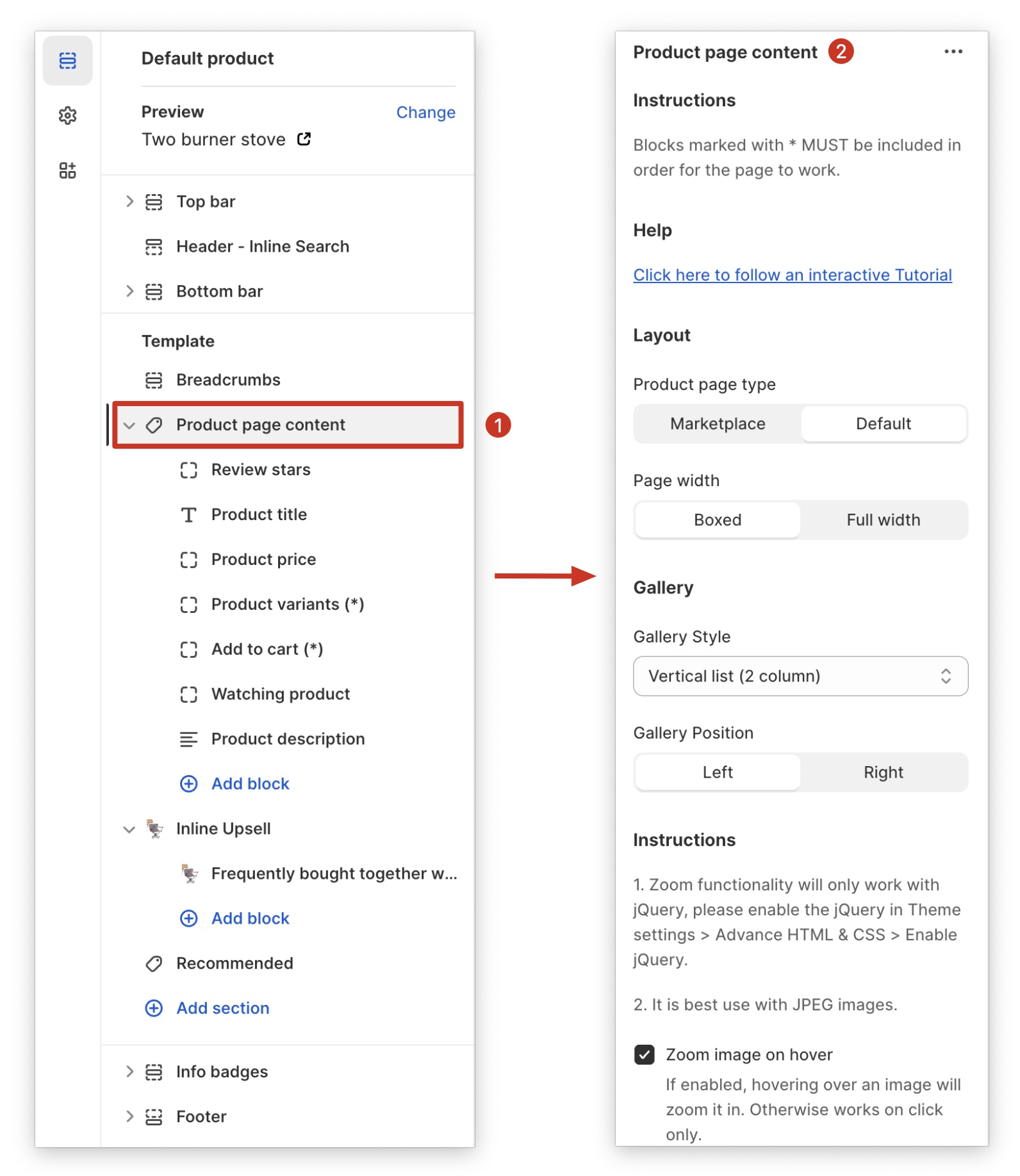
Layout
There are two distinct product page layouts available in Booster:
Default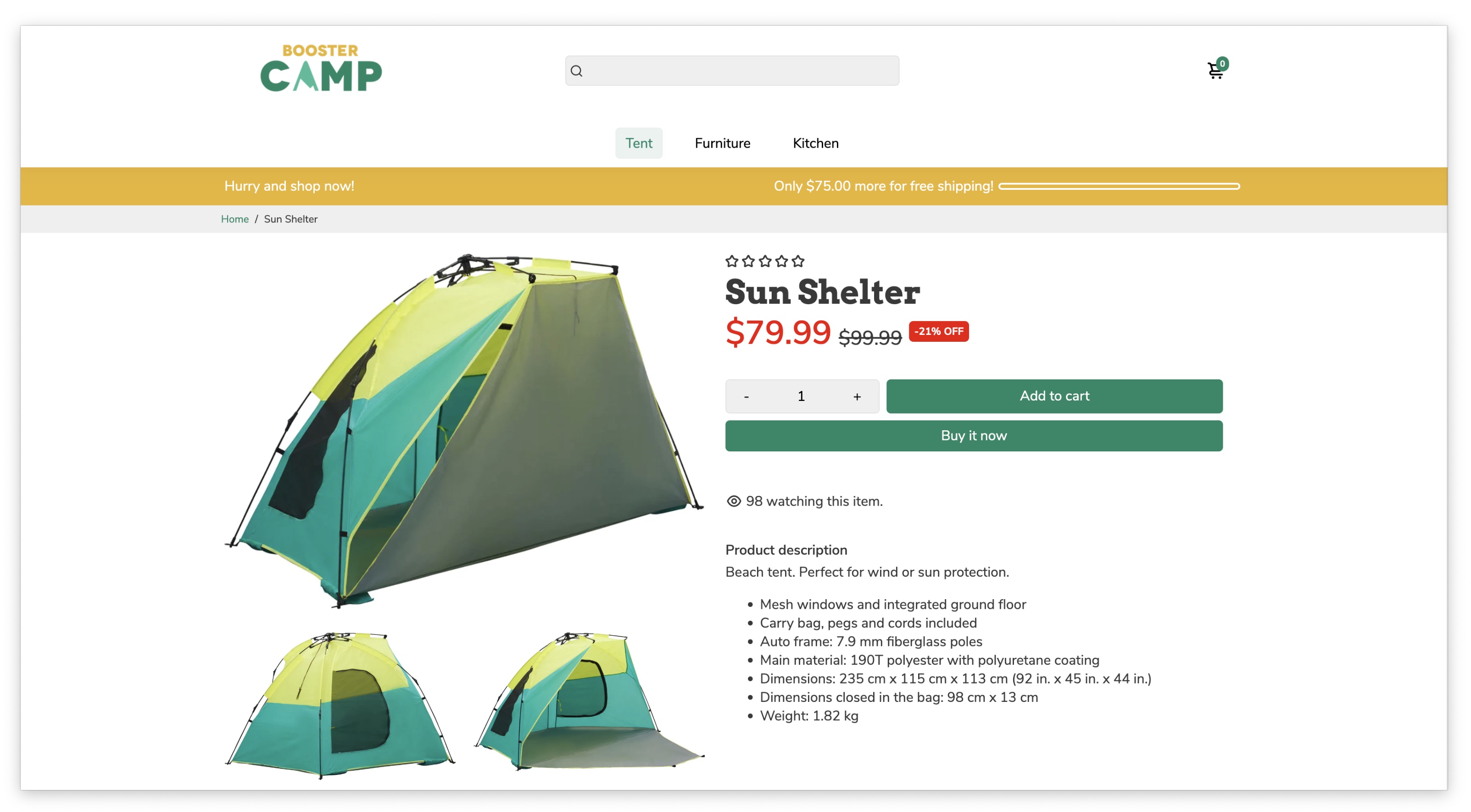
Marketplace
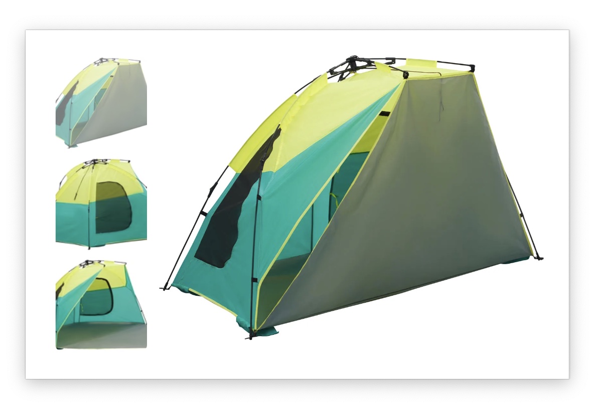
Gallery Style
This setting allows you to customize the look and feel of your gallery with three distinct options:
Default
Vertical list (1 column)
.jpg?hsLang=en)
Vertical list (2 columns)
.jpg?hsLang=en)
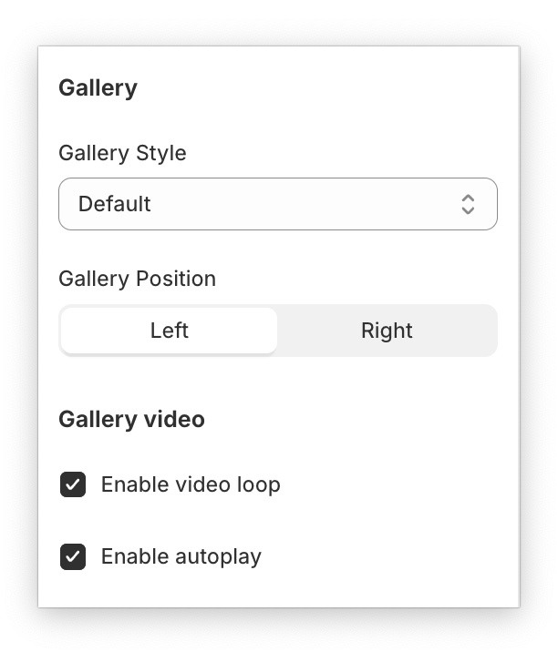
Thumbnail Position
This feature allows you to choose where product thumbnails appear within the product page image gallery. You can display thumbnails beside the main product image or place them below the main image in a clean horizontal layout.

Side

Below
Gallery video
This feature enables you to tailor the behavior of videos within your product page image gallery. You have the option to set the video to autoplay and loop, enhancing the visual experience for your customers. Autoplay initiates the video to play automatically when the page loads, while the loop feature allows the video to continuously replay.
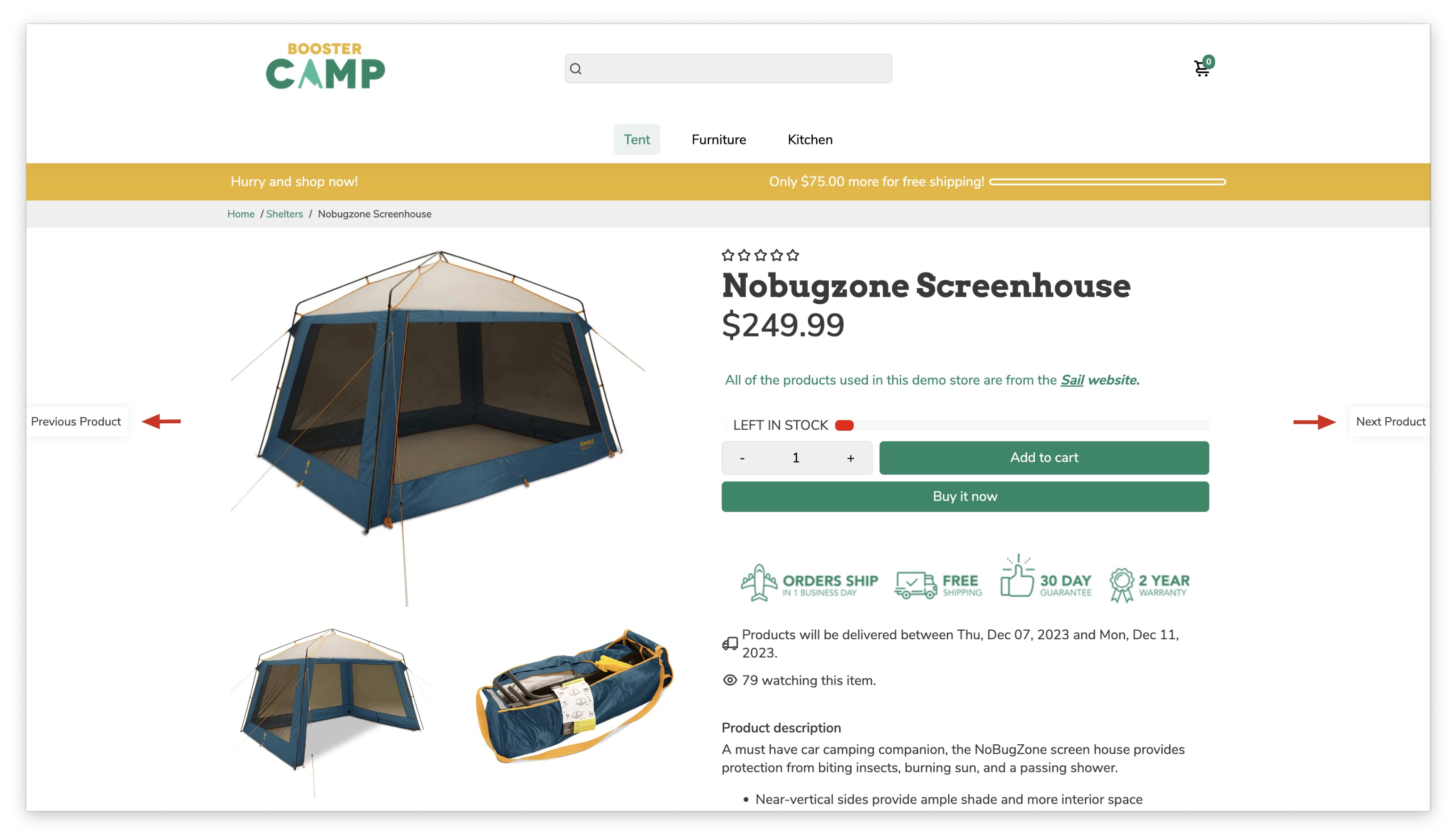
Previous/Next product
This feature allows you to add intuitive navigation buttons to your product page, making it easier for customers to browse through similar products in your collection.
Two buttons will appear on the left and right sides of your product page (see red arrows). Clicking the left button displays the previous product in the collection. Clicking the right button displays the next product in the collection.
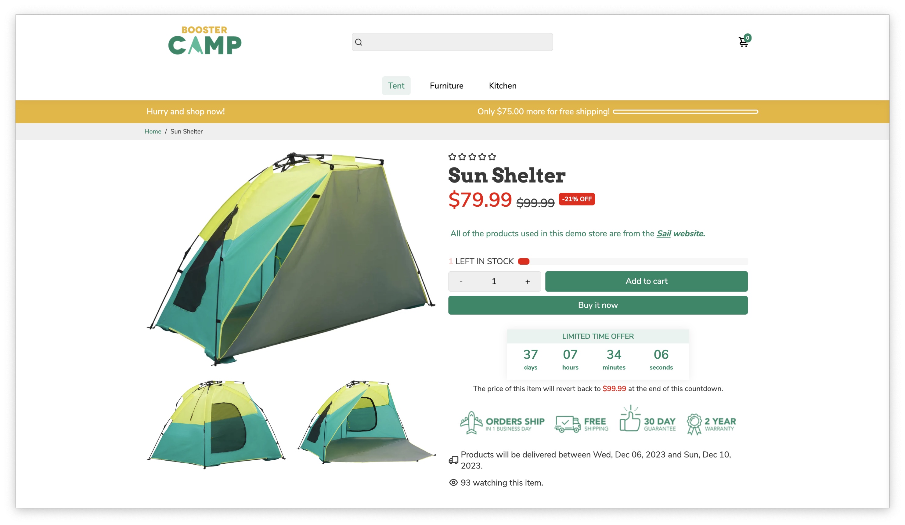
Product Page Content blocks
This exciting feature allows you to seamlessly integrate various content blocks onto your product page, enriching your customers' shopping experience and showcasing your brand story in unique ways.
How Can I Add Blocks to the Product Page Content?
Add blocks to your product page by clicking "Add block" in the left sidebar under "Product page content".
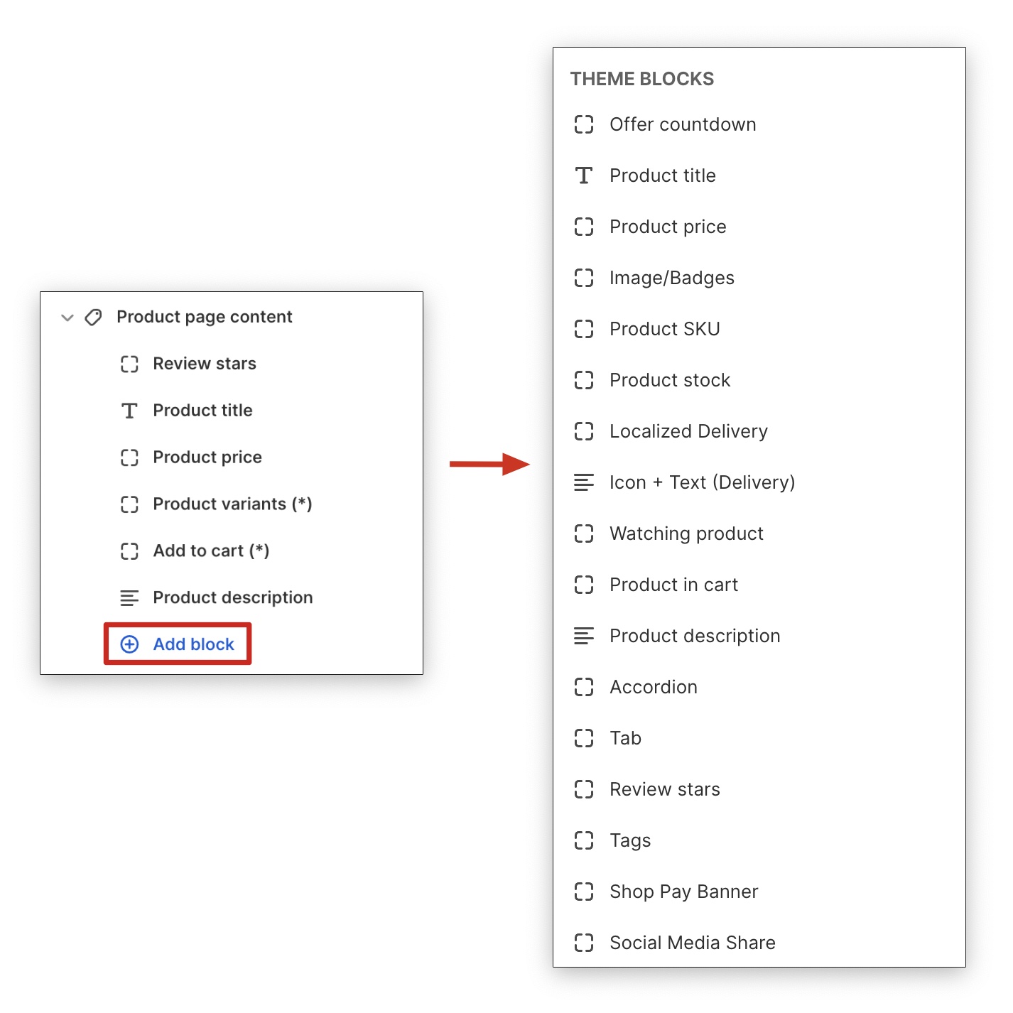
These are the top blocks commonly used and currently available under the Product page content section:
- Product Title
- Product Price
- Product Variants
- Product SKU
- Add to Cart
- Offer Countdown
- Product Stock
- Watching Product + Product in Cart
- Product Description
- Accordion / Tab
- Review Stars
- Social Media Share
- Localized Delivery
- Icon + Text (Delivery)
- Quantity Selector
- Order Attribute
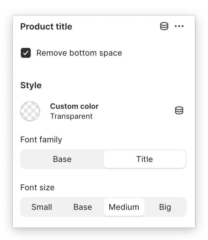
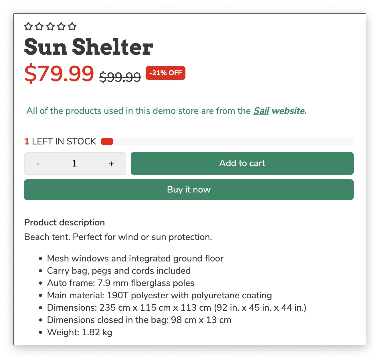
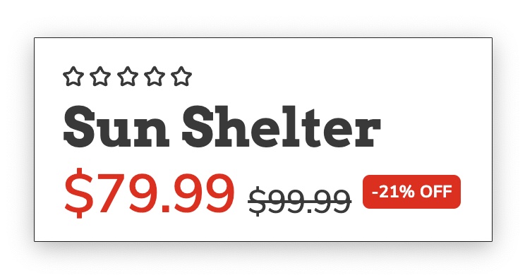
Product Title
Enhance your product title with custom color, size, and font.
Product Price
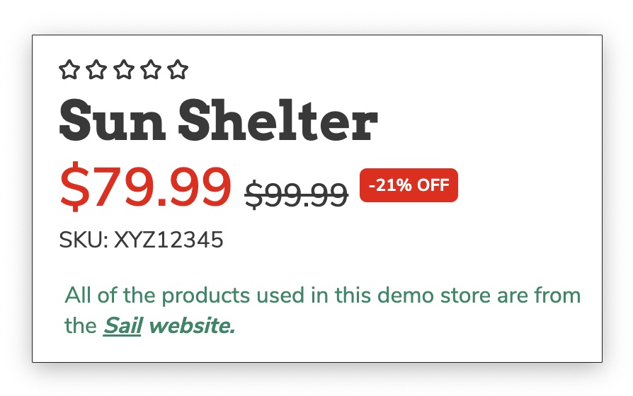
Change the Custom color, Font size & family of your product price to customize it further.
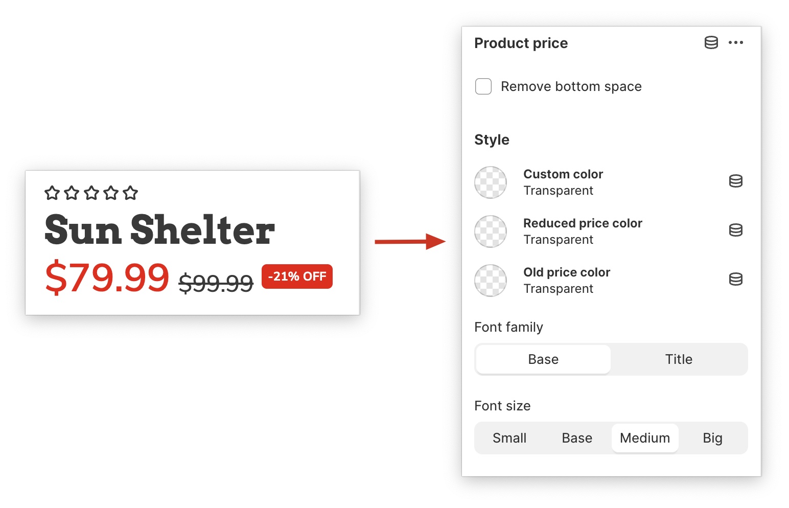
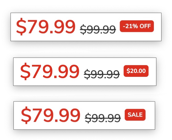
With Sales Badge you can add 4 options: Percent (1), Money amount (2), Only 'SALE' text (3).
Note: The sales badge settings for both Product price and Product card tags have have been combined into a single global option under Theme Settings → Product card tags.
Product variants
Product variants, also known as swatches, are a required element on your product page, allowing customers to easily choose between different options.
For a more in-depth tutorial on how to setup your Swatches, you can refer to this article.
Product SKU
This block displays the SKU of the product currently being viewed. The SKU provides a unique identifier for the product, allowing customers to easily verify they are purchasing the correct item. This is especially helpful for products with variations like color or size.
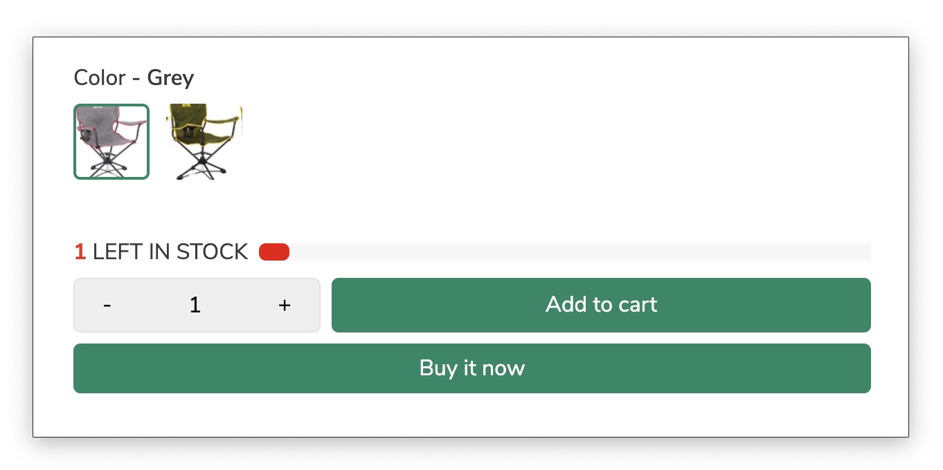
Add to cart
The add-to-cart block is the heart of your Shopify store, allowing customers to seamlessly purchase your products. This seemingly simple block plays a crucial role in your conversion rate, influencing the customer's decision to purchase. It should be visually appealing, easy to find, and provide a clear call to action.
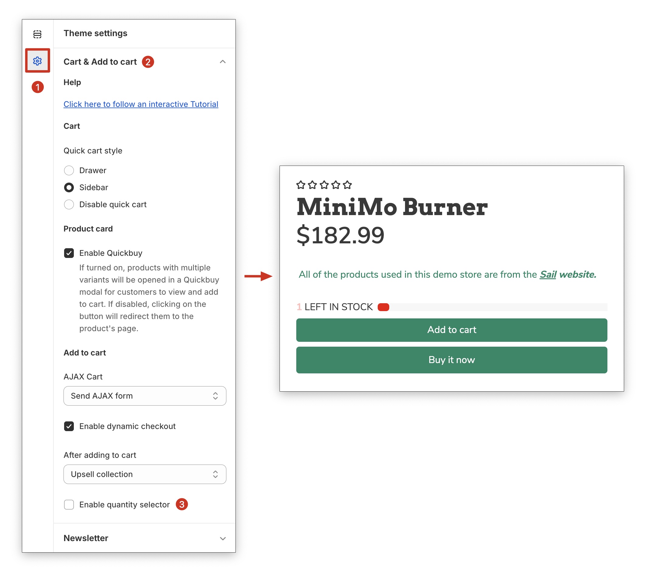
New! You can now choose how your Add-to-Cart (ATC) buttons are displayed on the product page.
- Side-by-Side Layout – Places buttons (e.g., Add to Cart and Buy Now) next to each other for a more compact, desktop-friendly experience.
- Stacked Layout – Displays buttons vertically for better spacing and improved usability on mobile.
This gives you more flexibility to match your store’s design and optimize conversions across devices.
Stacked

Sticky Add to Cart
This allows you to add a sticky Add to Cart button on your product pages, ensuring it remains visible even as users scroll down. This convenient feature encourages impulse purchases and simplifies the buying process, leading to increased conversions.
Desktop
Mobile
.jpg?hsLang=en)
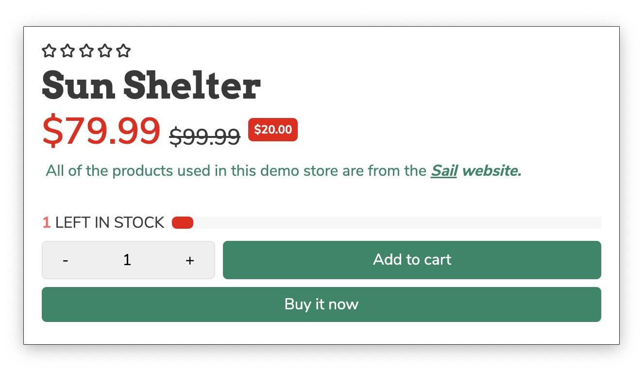
For single-item products, you can disable the Quantity Selector to streamline the buying experience.
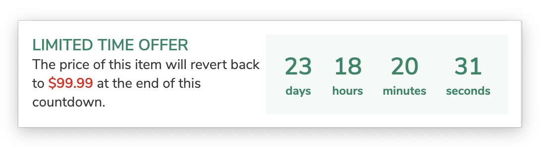
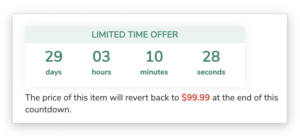
Offer countdown
Limited-time offers are a powerful tool for attracting customers and driving sales. An offer countdown timer creates a sense of urgency, motivating customers to take action before the offer expires. This psychological nudge can significantly increase conversion rates and boost your bottom line.
Customize your countdown timer with two available styles: a two-column format (1) or a compact format (2).
Warning text
Easily edit the text displayed below the countdown timer with this option. Use the %price% placeholder to automatically display the original price.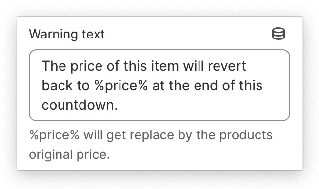
Product Stock
Displaying limited stock can create a sense of urgency and scarcity, prompting customers to purchase before the product runs out. This can lead to increased sales and conversions.
If customers don't see stock information readily available, they may abandon their carts out of uncertainty or frustration. Clear stock displays can prevent this and encourage the completion of purchases.
You have two choices on how to display your product inventory:
You can opt for either a real-time stock count or a dynamic number that adjusts based on your settings.
Max stock product
This feature allows you to showcase the maximum available stock for a product, choosing between pre-defined options like 10, 100, or 1000. Alternatively, you can opt for displaying the actual stock level.
Reduce inventory
This option allows you to customize the frequency of the refresh rate for the displayed stock. This functionality can't be used with actual stock levels. To deactivate it, set the value to 0.
Watching Product + Product in the cart
The "Watching product" and "Product in the cart" features generate social proof on your website, showcasing customer interest and encouraging others to engage.
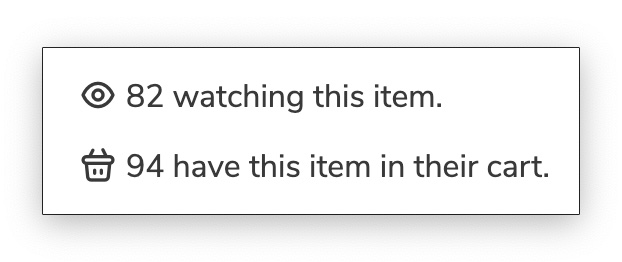
You have the flexibility to manipulate the displayed number of viewers and those with the same product in their cart. You can choose pre-defined options like 10, 100, or 1000 to create the desired social proof effect. Furthermore, you can control the update frequency for the displayed numbers.
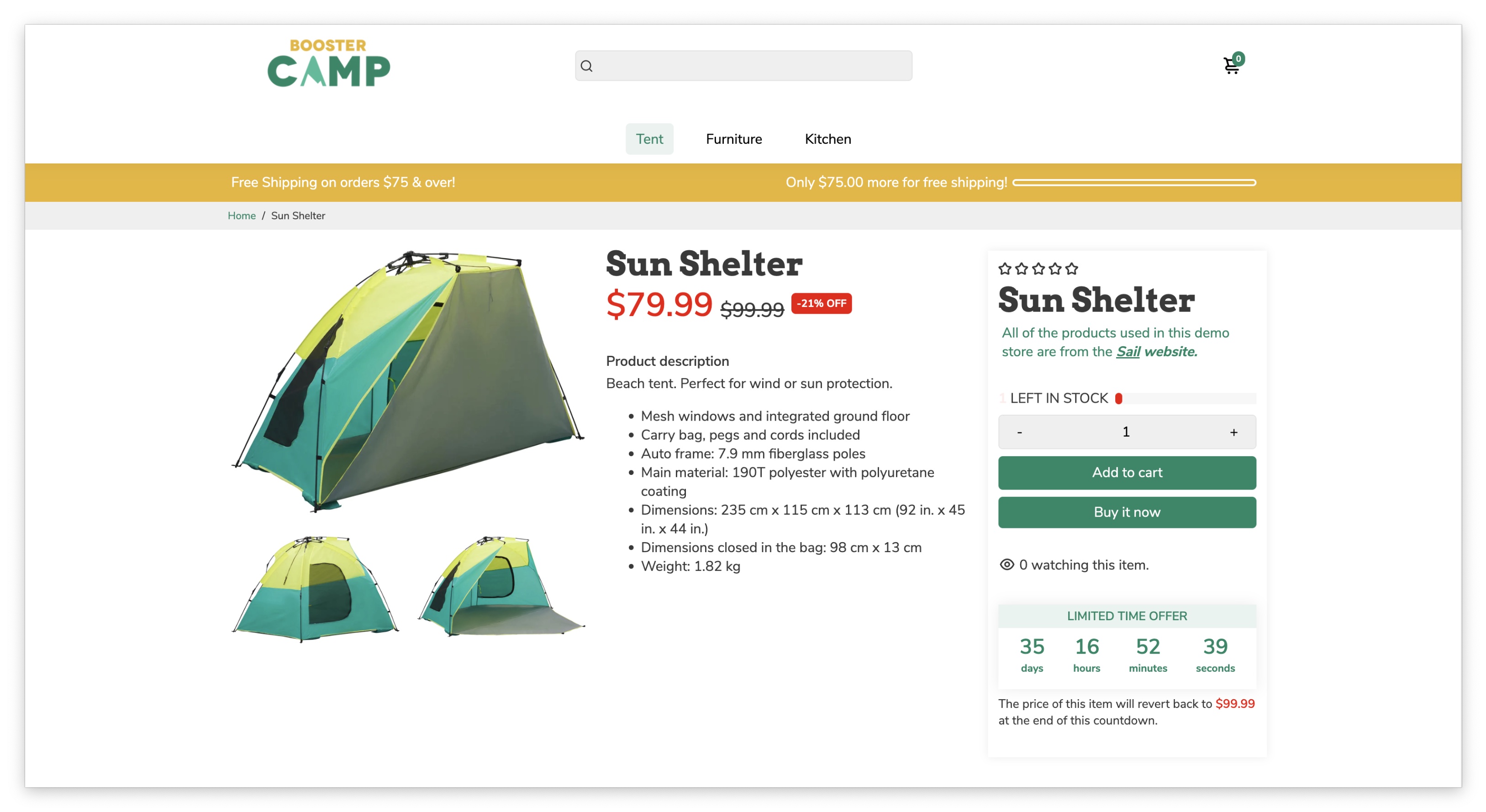
Product Description
Product descriptions provide detailed information about features, benefits, specifications, and more. This transparency builds trust with customers, allowing them to make informed purchasing decisions. Comprehensive descriptions address potential questions and concerns, reducing customer inquiries and improving the overall shopping experience.
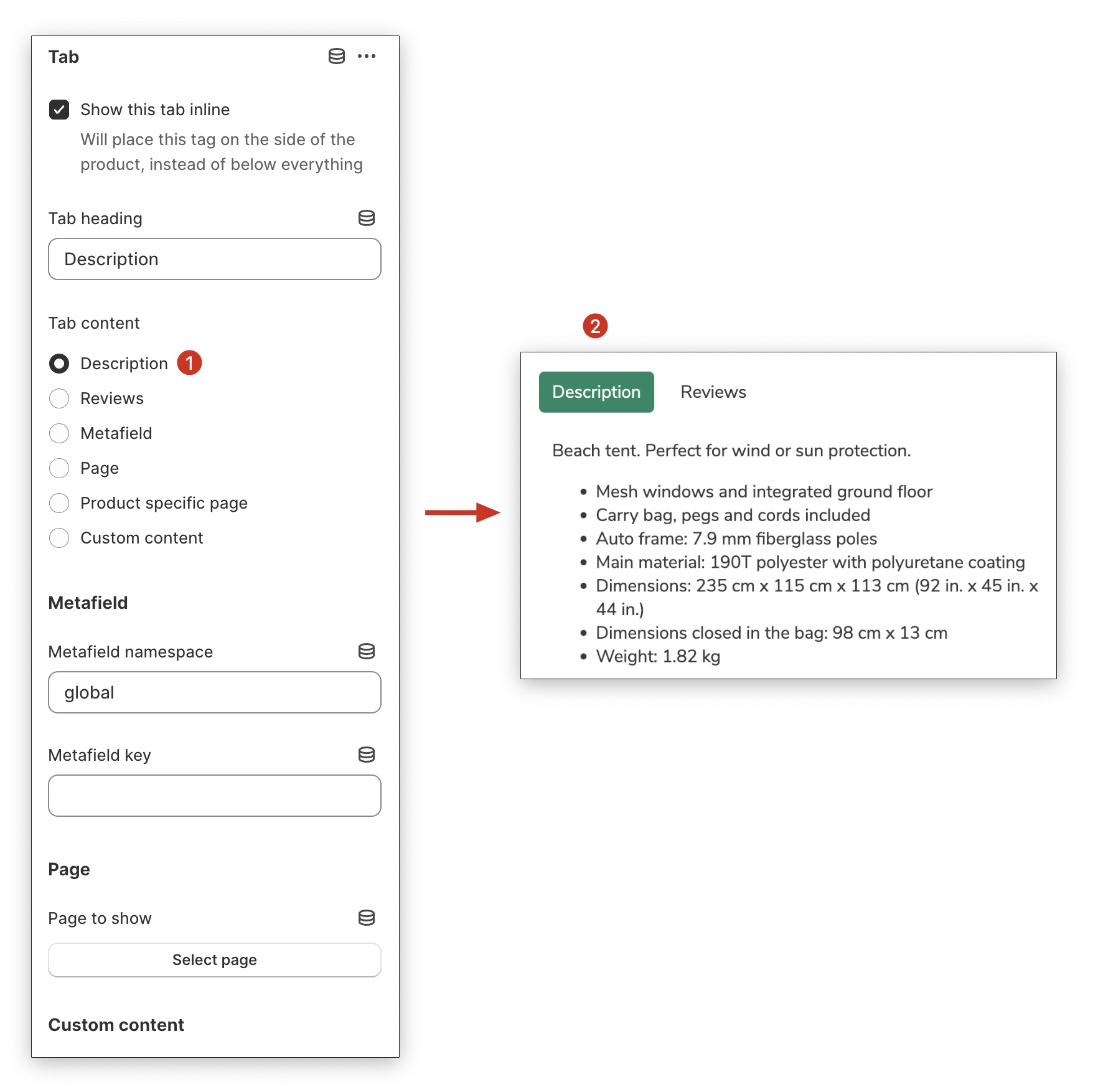
Accordion / Tab
Organize and present your content effectively by utilizing the Accordion and Tab blocks. Choose from six distinct types of content to best showcase your information, including:
- Description
- Reviews
- Metafield
- Page
- Product-specific page
- Custom content
Metafield (Advanced Setting)
The Metafield option helps you to personalize your Shopify store by storing and managing specialized information beyond the standard Shopify admin fields. This information can be utilized for internal purposes within your admin or displayed on your online store for a customized customer experience.
For a more in-depth tutorial on how to set up take advantage of the metafield option in Booster theme, you can refer to this article.
For further details regarding metafields, please refer to this Shopify article: https://help.shopify.com/en/manual/custom-data/metafields/using-metafields
Reviews stars
For in-depth tutorials on how to set up reviews in Booster Theme, you can refer to the following articles:
Social media share
This block allows your customers to share your product across their favourite platforms such as Facebook, Messenger, Twitter, Pinterest and Gmail.
Social media platforms have billions of active users, providing a massive potential audience for your products. By allowing customers to share directly, you can tap into their social networks and expose your products to a wider audience who may not have known about your brand before.
Localized delivery
This product page block ensures your customers have complete transparency regarding delivery timelines. Simply select the start and end dates, and the block will automatically display the delivery window for their orders.
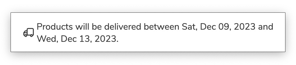
Icon + Text (Delivery)
This block shares some features with "Localized Delivery," but with a key difference: static delivery dates. However, it makes up for this by allowing you to personalize the icon and delivery message.
.jpg?hsLang=en)
Quantity Selector
This block allows customers to easily choose the quantity of a product they want to purchase before adding it to their cart. It helps improve the buying experience by making quantity selection clear, accessible, and easy to adjust.

Order Attribute
This block empowers your customers to personalize their orders by adding customer text or notes. They can add any additional information they wish to convey related to their order.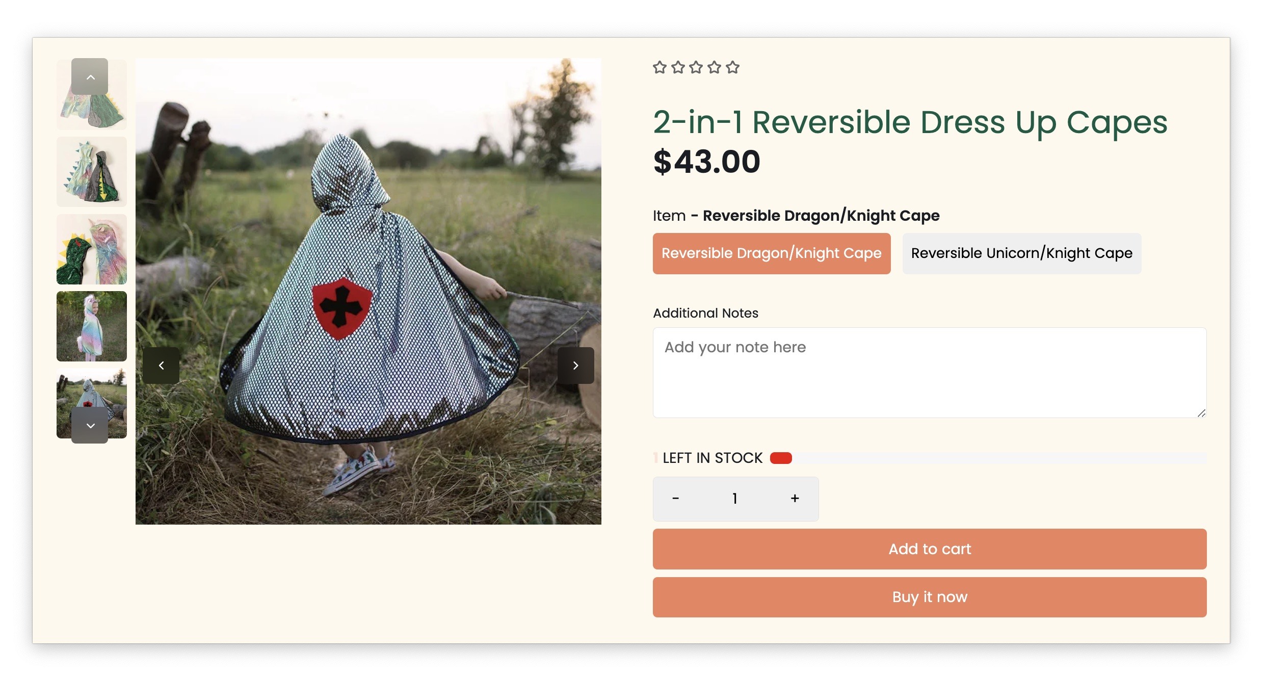
You're done!
- End of article -