![logo_white_booster-Sep-13-2022-06-54-02-62-PM.png]](https://help.boostertheme.com/hs-fs/hubfs/logo_white_booster-Sep-13-2022-06-54-02-62-PM.png?height=36&name=logo_white_booster-Sep-13-2022-06-54-02-62-PM.png)
The general layout settings are the settings you'll find by default in almost all homepage sections whatever it is, therefore it's important to learn how to use them.
Content blocks are elements you can add in some sections of Booster Theme, you will mostly use it for the Call to Action section that used a lot!
In this article, we will explain everything setting by settings. You may not need to read the whole article, because some settings are simple and understandable without having to read it, therefore it's all there whenever you need it!
In this article:
- General layout settings
- Section Layout
- Section Background
- Background Overlay
- Section Content
- Section Heading
- Content Block Settings
- Most Common Blocks used
General layout settings
There are many general settings available in Booster Theme, making it a highly flexible theme. These settings are designed to be user-friendly and easy to understand, allowing you to customize your website with ease.
Section Layout
1. Show this section on
Sometimes, you don't want one section to show on mobile because it is not looking good for various reasons, then you can decide to show this section only on Desktop by a click. This feature is really great for optimizing your website for mobile or desktop without affecting the other.
You can select to show this section on:
- All devices
- Mobile
- Desktop

2. Site layout
You'll be able to use this setting to change the layout of your sections if you don't want them to follow the global default. It is an essential setting to create an amazing website layout.
There are 3 different possible layouts: Boxed, Fullwidth background, Fullwidth.
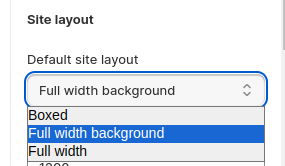
We made a complete article about this! See it here.
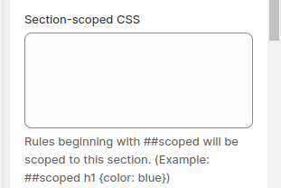
3. Section-scoped CSS
This setting enables you to apply CSS rules only to the sections you are currently working on. This makes the customization process much easier.
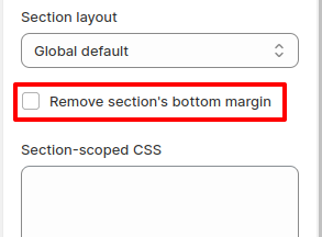
4. Remove section's bottom margin
The section bottom margin is the little space that is at the bottom of each section. Sometimes it feel better without it, so with made the setting for it.
5. Minimum height
This setting allows you to adjust the minimum height of the section, giving you control over the vertical space it occupies on your website.
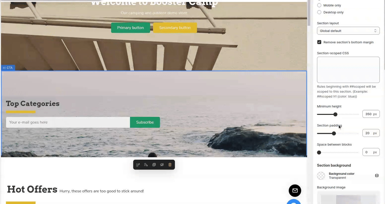
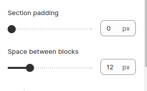
5. Section padding and Space between blocks
This settings allows you to adjust the spacing between content blocks within a section. By adding padding, you can create space around the content.
Section Background
1. Background color
This setting modifies the color of your section's background.
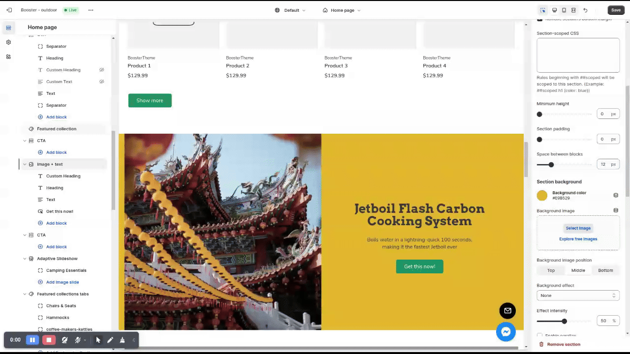
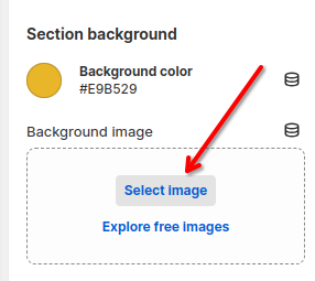
2. Background image
This setting modifies the image of your section's background.
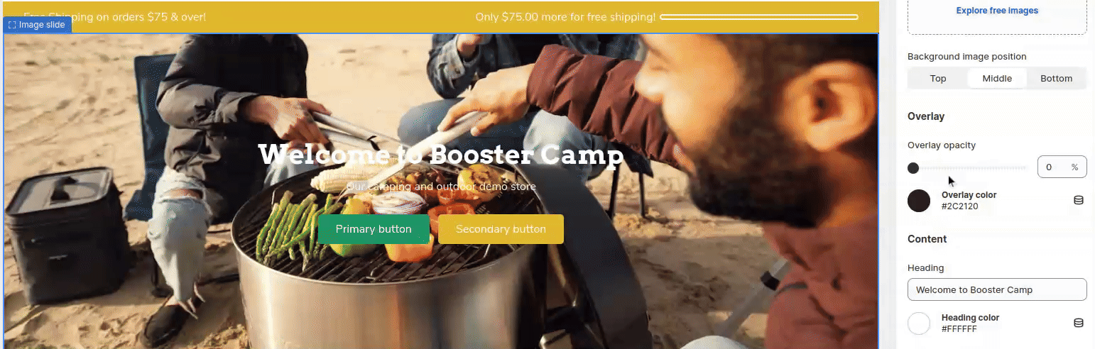
3. Background image position
This setting modifies the image position of your section's background.

4. Parallax
You can put a parallax effect on one of your backgrounds in order to create a visually captivating section.
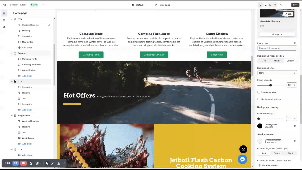
Background Overlay
An overlay is a filter you put over a certain image in order to match it with your branding or simply giving it a better look.
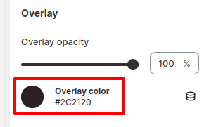
1. Overlay opacity
This setting modifies the overlay opacity. You can choose between 0% from 100%
2. Overlay color
This setting modifies the overlay color.
Section Content
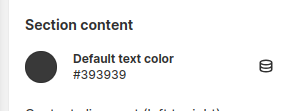
1. Default text color
This setting modifies the color of the text and the buttons.
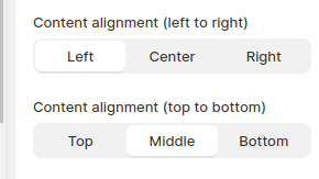
2. Content alignment(left to right) & (top to bottom)
This setting allows you to modify the alignment of your block. You can choose between 3 different options on the vertical: Left(1), Center(2), Right(3) and 3 different options on the horizontal: Top(1), Middle(2), Bottom(3)
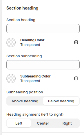
Section Heading
You have the option to modify the heading of your section, allowing you to add a header that stands out.
Similarly, you can also modify the subheading of your section to provide additional information or context.
In addition, you have the ability to choose the position of the subheading relative to the heading. You can place it either above the heading or below it.
Furthermore, you can adjust the alignment of your heading. You have three options to choose from: left alignment, center alignment, or right alignment.
Content Block Settings
In some categories in Booster Theme, you can add content blocks to your section, this is a great way to customize your store to make it unique.
Add Content Block
Adding a content block is super simple, add a call to action and click "Add Block" within a section, you'll have access to the various content block that Booster theme to offer. 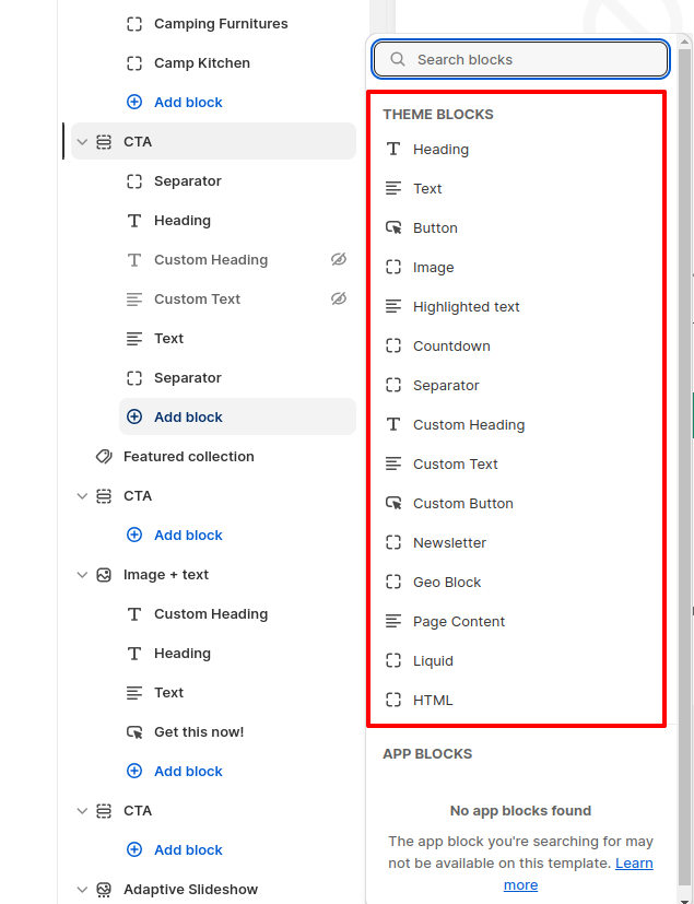
General settings for content blocks
In most of the blocks, you'll find settings that are the same.
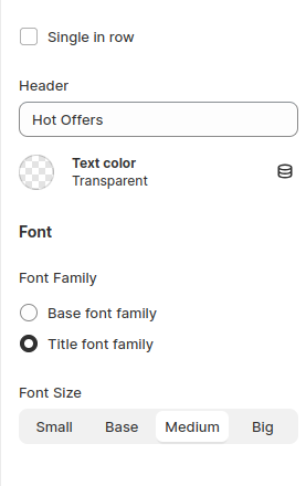
1. Single in row
Enabling this will make your element the only element on the row. Therefore, if you keep it disable you'll be to put a heading or another element besides a button as an example.
Make sure to have both blocks unchecked in order to have them on the same line.
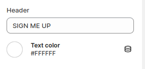
2. Text color
This setting is to change your text color.
3. Font family
This setting allows you to choose between your two font presets.
4. Font size
This setting allows you to change the font size. You can choose between 4 options: Small(1), Base(2), Medium(3), Big(4).
Most Common Blocks used
1. Heading Block
The heading block can be used to add a header to a section.
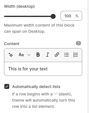
2. Text Block
The text block allows you to choose the maximum width for your content. This setting is where you can write your text. Additionally, when you activate the "Automatically detect lists" setting, if a row begins with a '-' (dash), the theme will automatically convert it into a list element.
3. Button Block
i. Button text
This setting modifies the button text.
ii. Links to
This setting allows you to add a link to your button. You can either directly paste a link or search for one of your pages or products.
iii. Button icon
This is the location where you'll need to put the name of the icon you want. There are more than 2200 icons available on the Unicons library.
More information about how to use the Unicons library here
iv. Button style
You can also make the button full width.
This setting allows you to choose between your primary or secondary style.
More information about how to modify the button combination here
v. Button type
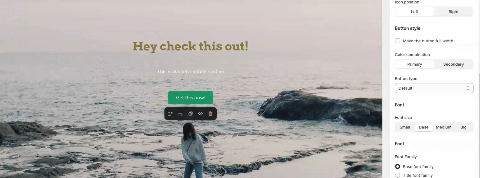
This setting allows you to change the button type. There are 4 different options: Filled(1), Ghost(2), Text(3), Underlined(4)
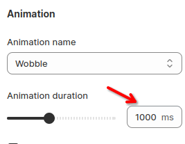
vi. Animation
This setting allows you to animate your button. There are many different animations available. See some examples in the gif below.
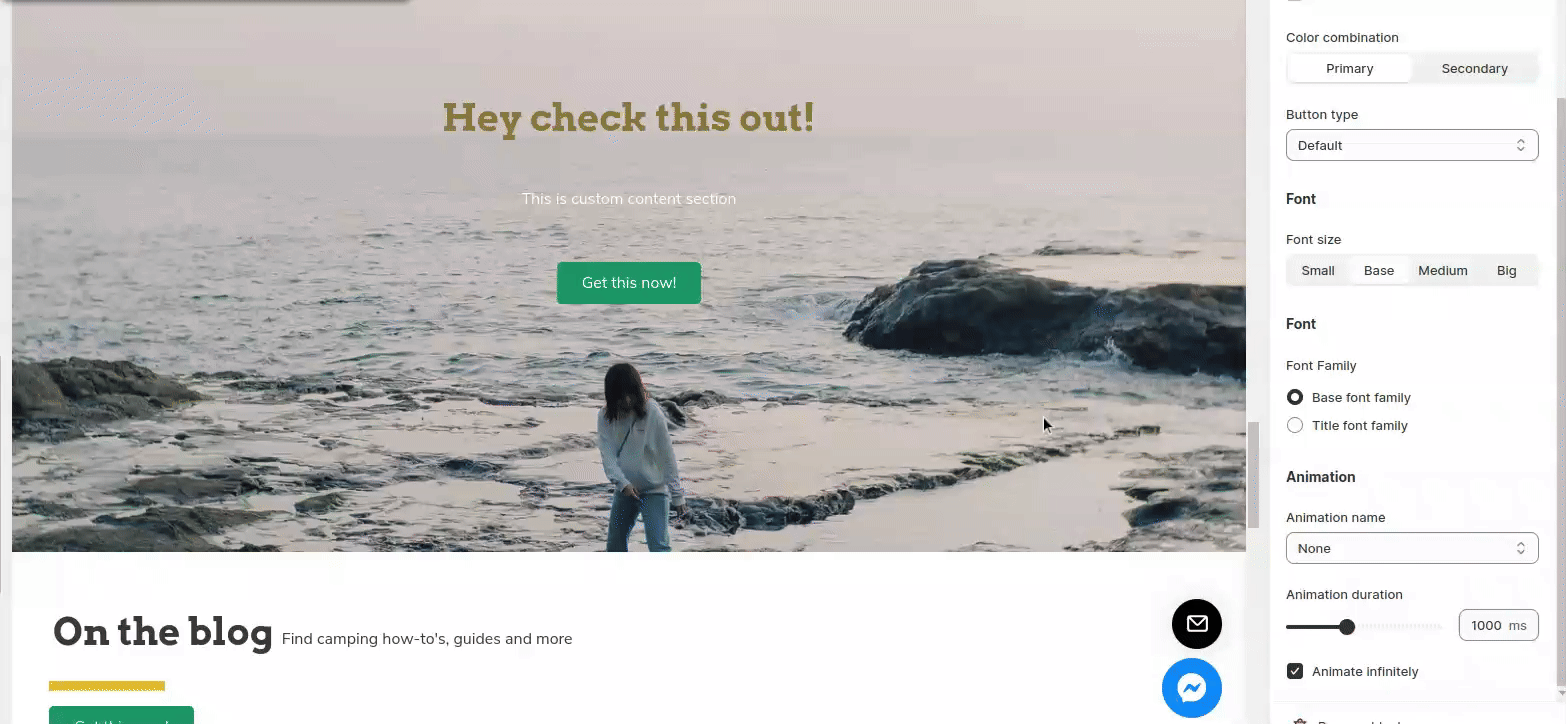
vii. Animation duration
This setting allows you to change the duration of your animation. You can choose between 100ms and 2500ms.
viii. Animate infinitely
This setting allows you to choose if your animation is infinitely or only for a short period of time.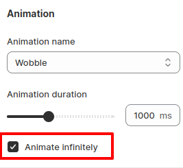
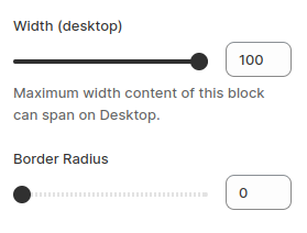
4. Image block
You have the option to choose the maximum width of your image, allowing you to control its size on your website.
Additionally, you can apply rounded corners to your image, giving it a more polished and visually appealing look.
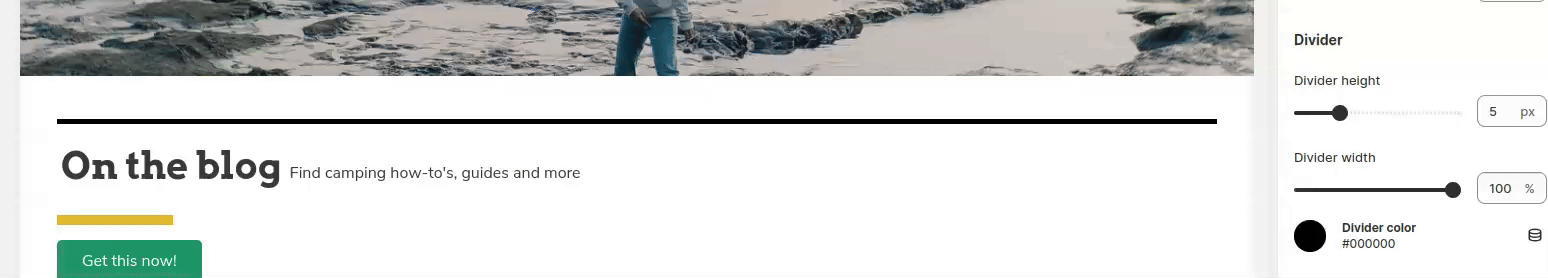
5. Separator Block
You have the option to adjust the height of your divider, allowing you to choose a height between 0 pixels and 20 pixels.
Similarly, you can also modify the width of your divider, with the option to choose a width between 5% and 100%.
Furthermore, you have the ability to change the height of your separator, giving you the flexibility to select a height between 0 pixels and 250 pixels.
6. Custom Heading, Custom Text, Custom Button
Those custom blocks are not based on your preset. They allow you to make a custom content block instead of using the preset you made in your Theme Settings. Those custom content blocks have the same settings as the non-custom content block. You'll be able to use them the same way you use the others, therefore the custom button block does have more advanced settings. In order, to understand how to properly use them, read this article: Buttons settings
- End of the article -