![logo_white_booster-Sep-13-2022-06-54-02-62-PM.png]](https://help.boostertheme.com/hs-fs/hubfs/logo_white_booster-Sep-13-2022-06-54-02-62-PM.png?height=36&name=logo_white_booster-Sep-13-2022-06-54-02-62-PM.png)

The Buttons and Inputs Settings in Booster Theme offer a variety of customization options to enhance the look of buttons and input fields in your Shopify store. With these settings, you can create an attractive and user-friendly interface that showcases your brand's personality and attracts customers.
In this article:
- Accessing Buttons and inputs in Theme setting
- Button dimensions
- Primary and Secondary Buttons
- Combination of Button Color
- Button Hover Effect
- Enabling Custom Border
- Input Color Combinations
- Slider Button
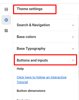
Accessing Buttons and inputs in Theme setting
To access the Buttons and inputs Settings, click Customize (Themes section on Shopify) > Theme settings > Buttons and inputs
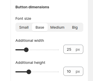
Button dimensions
With this setting's help, you can customize the font, width, and height of your default button preset.
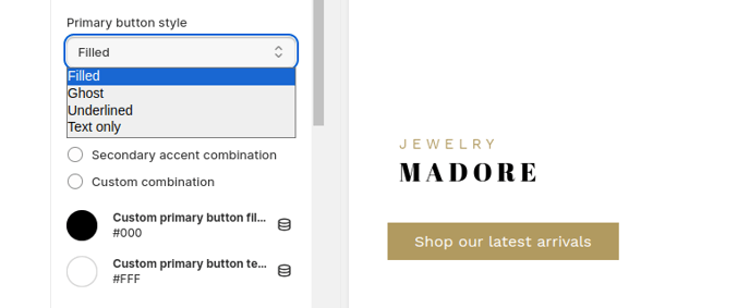
Primary and Secondary Buttons
Booster Theme allows a user to create two buttons for their Shopify Store. See them as preset, for instance, if you are looking to modify your CTA, you can pick between your button style's primary or secondary options. With this option's help, you get the convenience to style and color your secondary and primary buttons as per your wishes.
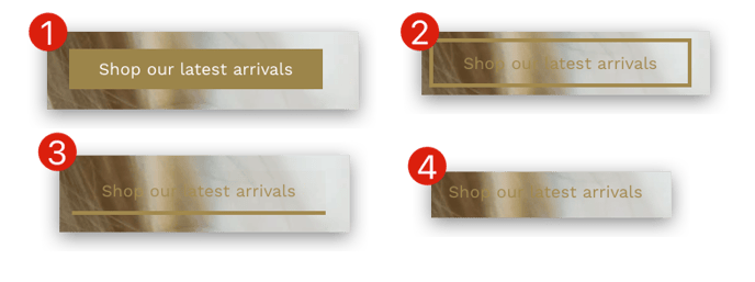
Furthermore, you get four options to alter the style integrated into your buttons. You can choose between Filled(1), Ghost(2), Underlined(3), and Text-Only(4).
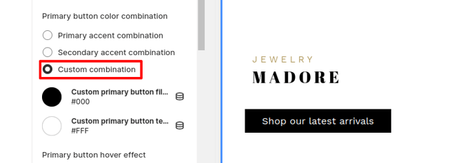
Combination of Button Color
With this setting, you can choose from one of the two preset colors. You can either choose one of the available options, that is, from the primary and secondary color combinations, or you can apply custom colors as well.
More information about how to modify the Color combinations here
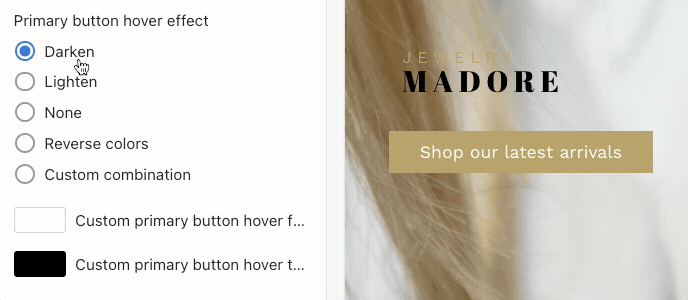
Button Hover Effect
By enabling this setting, the user will experience the hover effect on the button. It means that once you hover your mouse pointer on the button, the color of the button will change. There are five different choices provided for the users to choose from: Darken(1), Lighten(2), None(3), Reverse Colours(4), and Custom Combinations(5).
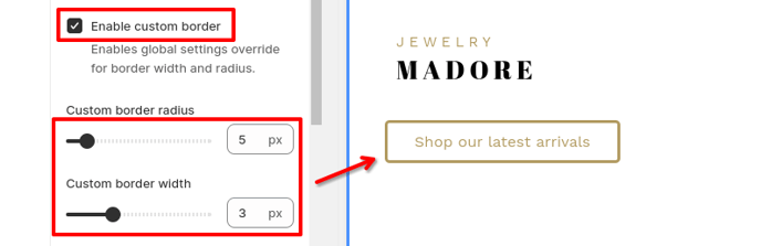
Enabling Custom Border
This option provides the modification of the borders around the buttons. The user can also apply custom settings to the borders.
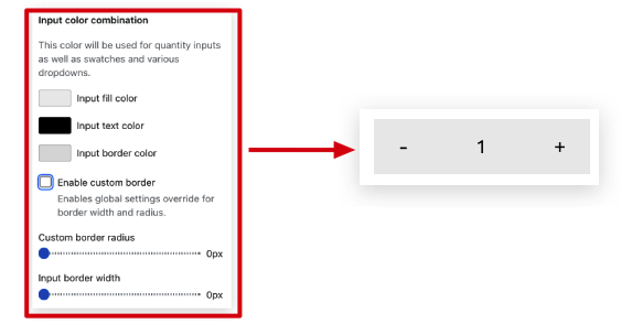
Input Color Combinations
The input is the place where people can enter a specific quantity for something. For instance, while buying a product, in the cart, the user must fill in the number of products that are to be bought. You can change the Text Colour, Fill Colour, or the Border Colour of the Input to make it look more attractive. Try different options to choose from what suits you best.
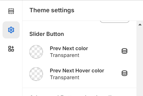
Slider Button
This feature enables you to customize the color of the slider's previous/next buttons. You have the option to change both the button color and the hover color.
- End of the article -