![logo_white_booster-Sep-13-2022-06-54-02-62-PM.png]](https://help.boostertheme.com/hs-fs/hubfs/logo_white_booster-Sep-13-2022-06-54-02-62-PM.png?height=36&name=logo_white_booster-Sep-13-2022-06-54-02-62-PM.png)

With the help of our Booster Theme, you get the convenience of setting up slideshows easily. We understand that the slideshows help to attract a customer's attention and make your Shopify store look more appealing. Read on to learn how to set up slideshows successfully in Booster Theme.
In this article:
- Video tutorial
- Slideshows available in Booster Theme
- Setting up your slideshow
- Autoplay slides
- Animations
- Content animations available
- Animating all elements at once
- How to make the slideshow responsive
Let's get started!
Full-width images that include slideshows and images with text overlays make the store look appealing and add to the product's charm on the page. We provide you with a chance to grab attention by using slideshows. Build your brand's identity by using relevant images and setting them up for a slideshow.
Video Tutorial
Slideshows available in Booster Theme
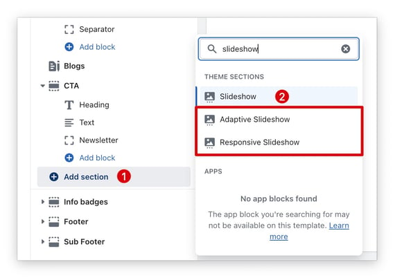
1. Adaptive Slideshow
Adapts to the width and height of the image. If you want your image to show entirely choose this option.
2. Responsive Slideshow
Allow you to select mobile and desktop images separately, this way you can optimize your page speed on your mobile version without putting aside your desktop UX.
3. Default Slideshow
Makes a standard slideshow, but you have the option to add a video as a slide.
Setting up your slideshow
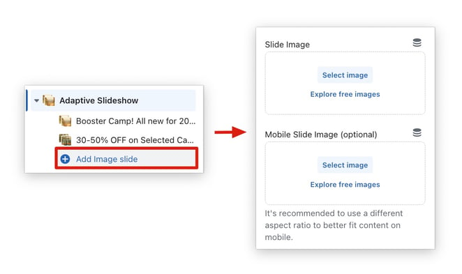
To add a slideshow to your homepage, click on Add Section → Slideshow/Responsive Slideshow/Adaptive Slideshow → Add Image Slide.
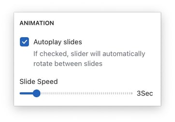
Autoplay slides
With this setting, the slides will autoplay, the customer won't need to click on the arrow to change the slides, it will do it automatically.
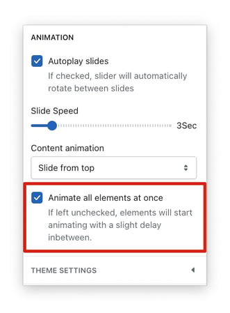
Animations
We provide the convenience of setting up animations for your slideshows to make them look more attractive and enhance the visitor’s experience. You can animate the content, images, or any other elements which are used in the slideshow.
Content animations available
- Fade in
- Slide and fade in
- Slide from top
- Slide from bottom
- Slide from left
- Slide from right
- Grow
- Rotate and grow
- Shake
Animating all elements at once
This section allows the animation of every element present in your slideshow. You can either choose to animate them separately or all together.
By checking on the option of animating all elements on your slideshow at once, you get the feasibility of altering all of them at once. By unchecking, each element will behave separately and will animate at different time slots. However, by animating separately, you may experience a slight delay in each animation.
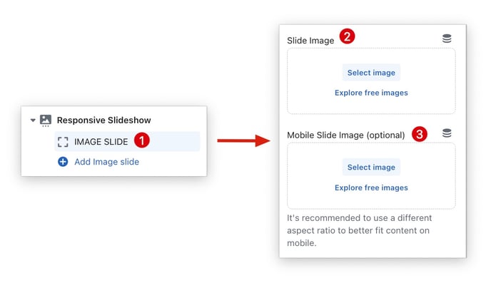
How to make the slideshow responsive
The default slideshow can sometimes not be optimal for your mobile and desktop at the same time. It's recommended to use a different aspect ratio to better fit content on mobile. The responsive slideshow and adaptive slideshow allow you to upload different images for your desktop and mobile.
Note: If you want to always show the full height of the image, you can use the Adaptive Slideshow. This slider will adjust its height to the currently shown image.
Make sure to add a separate image for mobile with a different aspect ratio.
- End of article -