![logo_white_booster-Sep-13-2022-06-54-02-62-PM.png]](https://help.boostertheme.com/hs-fs/hubfs/logo_white_booster-Sep-13-2022-06-54-02-62-PM.png?height=36&name=logo_white_booster-Sep-13-2022-06-54-02-62-PM.png)
Booster Theme's three essential elements—sections, blocks, and theme settings—offer endless customization options, empowering you to craft a unique and visually appealing online store that perfectly reflects your brand and resonates with your target audience.
Used together, these elements give you complete control over every aspect of your store's design, from the big picture to the smallest details. Whether you're a seasoned designer or a complete beginner, Booster Theme's intuitive interface makes it easy to create a store that's both professional and visually stunning.
In this article:
- What are sections and blocks?
- Add your first section
- Add your first block
- Play with the section settings and block settings
- Discover the overall theme settings
What are Sections & Blocks?
Sections are ways to show your content, each section has its own layout and features. With Booster Theme, you'll have over 25 different sections. With these, you can create a bunch of content and show them in different ways.
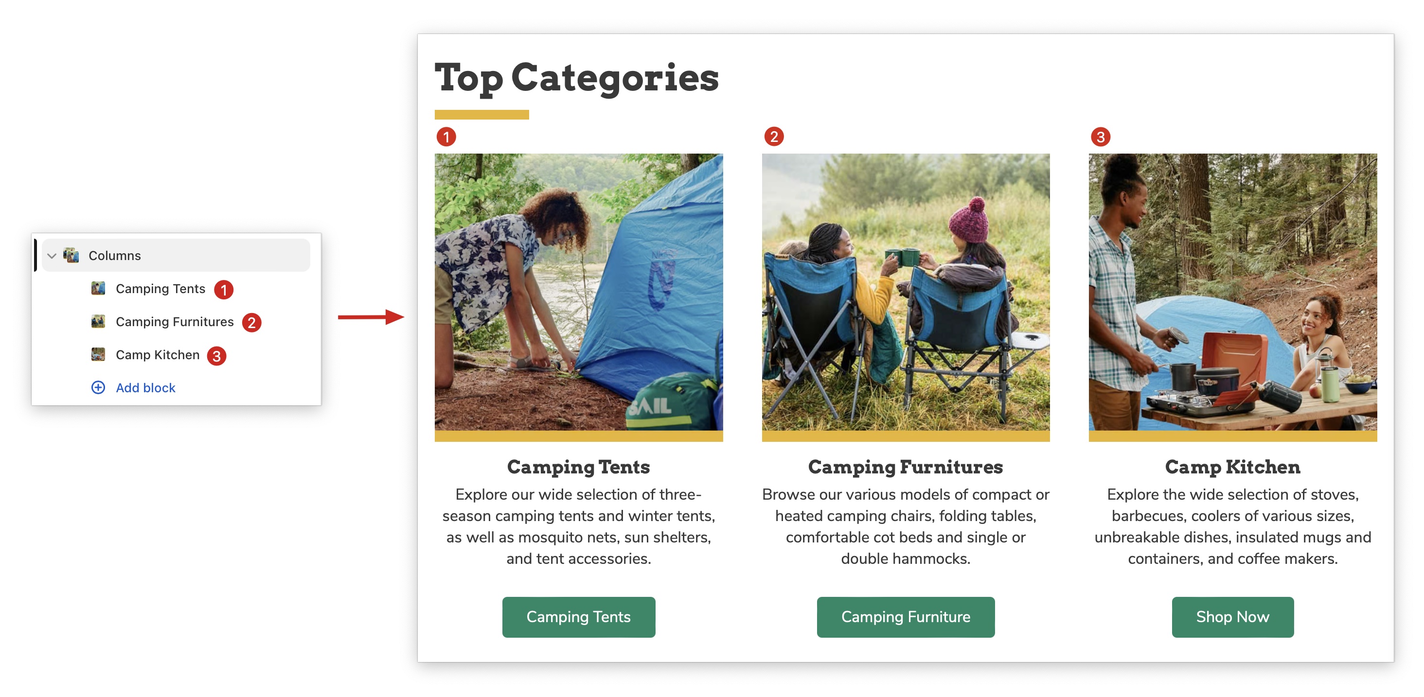
Blocks are the content elements that make up your website. The blocks are used inside the sections in order to fill them with content.
As you can see in this image, there are 4 collections blocks inside the List collections section. Blocks fill the section with content.
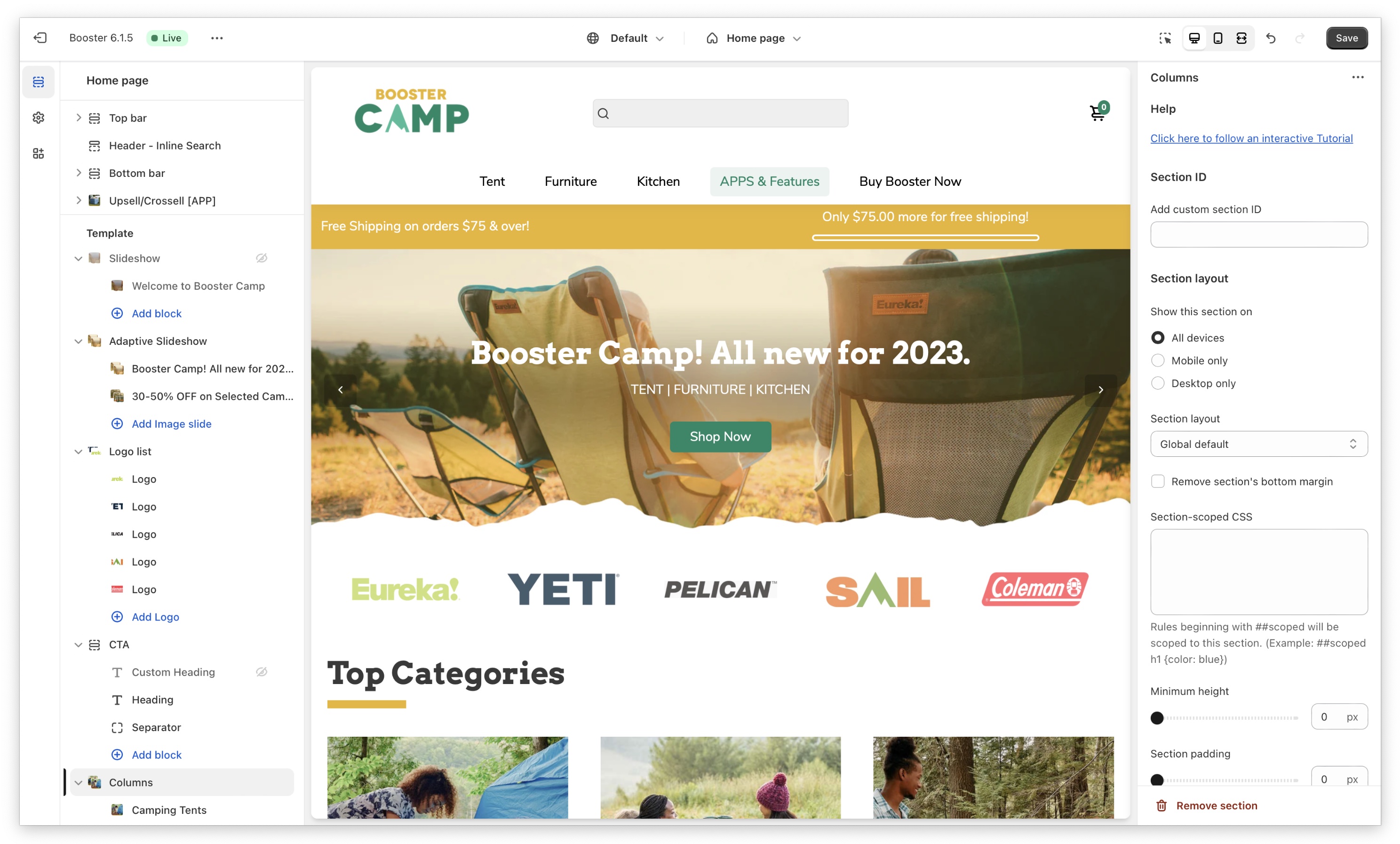
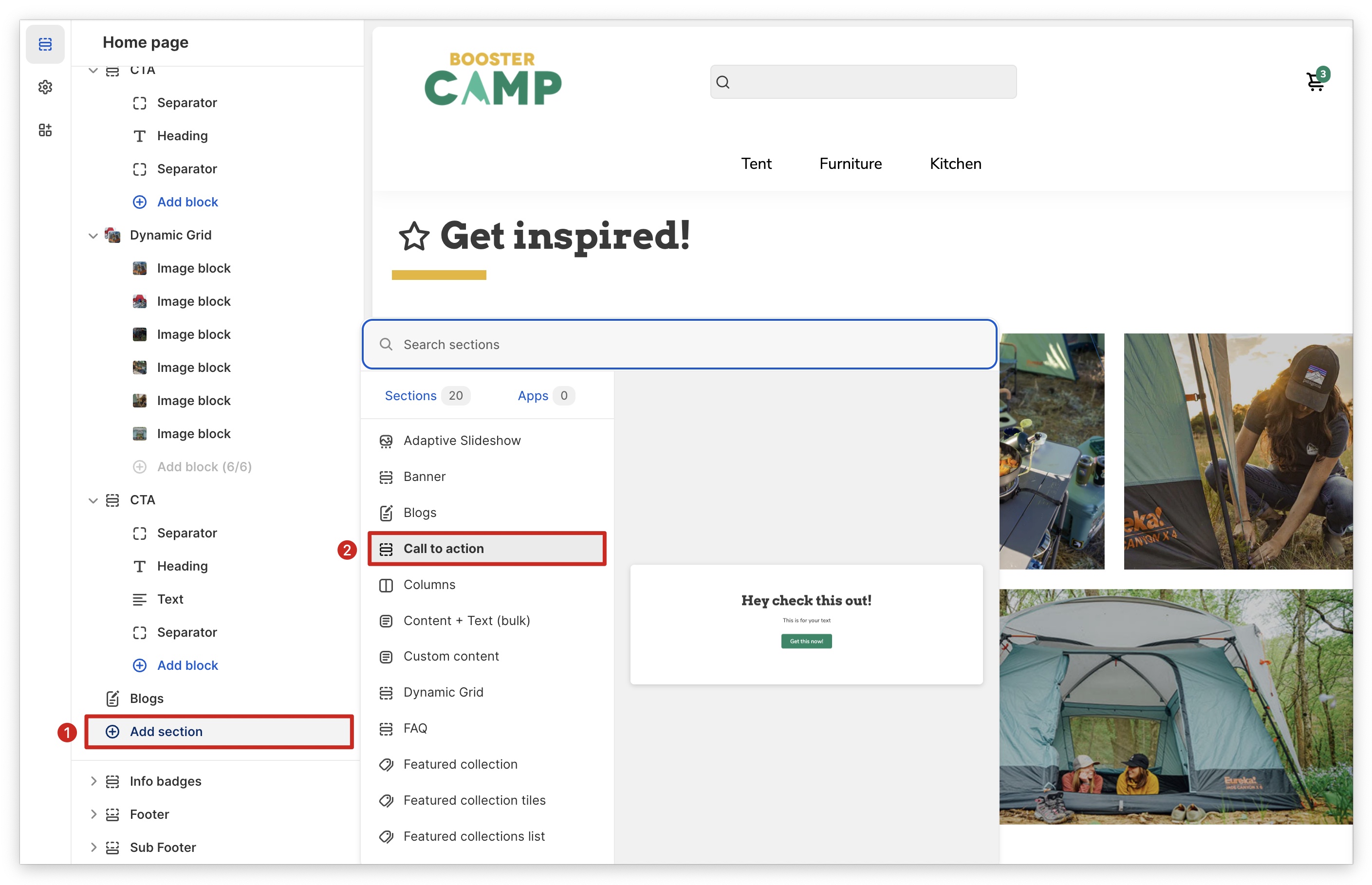
Adding Your First Section
First, let's start by adding the first section.
Adding Your First Block
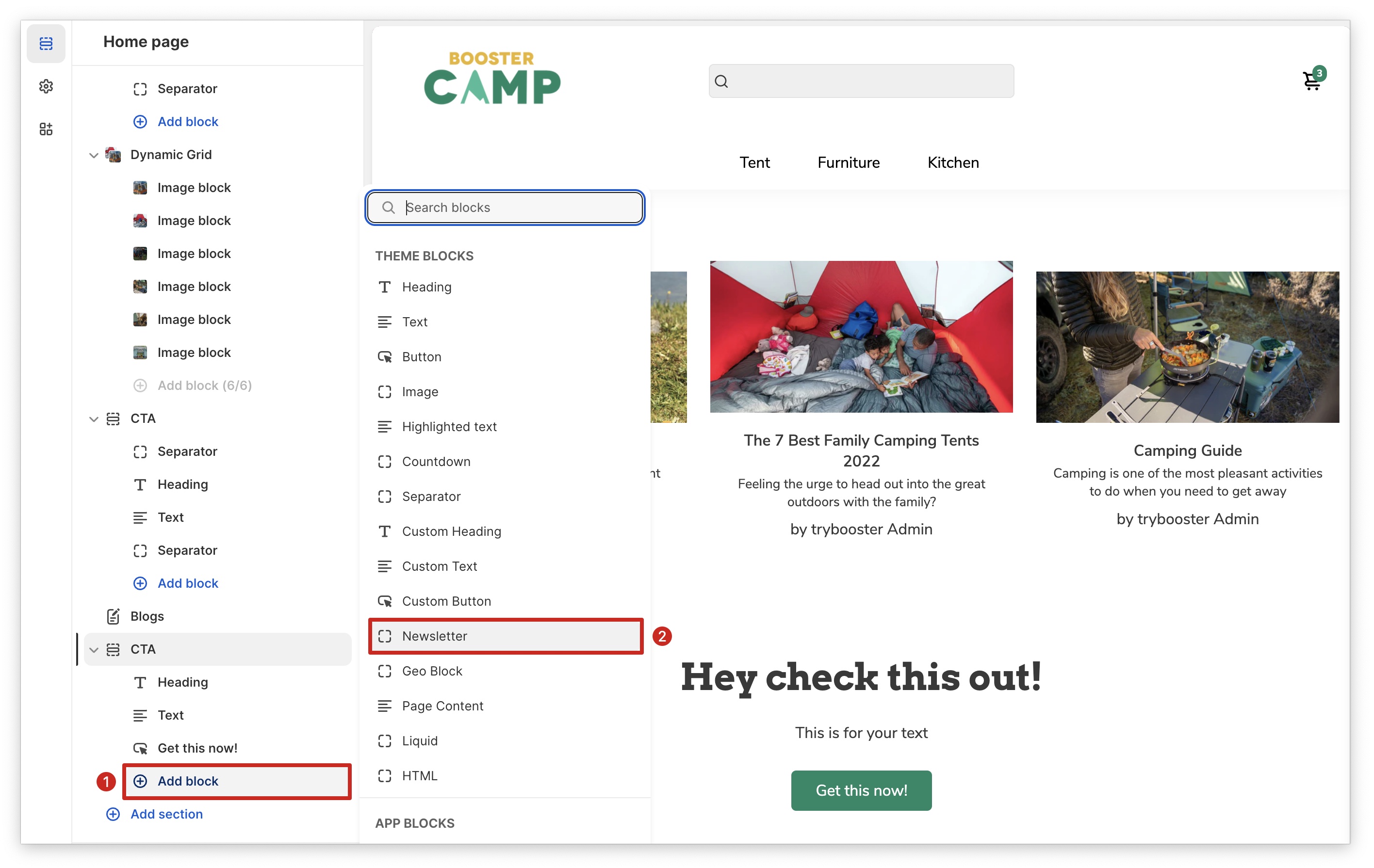
Sections and content blocks are the building blocks of your online store. Understanding how they work will give you endless possibilities for creating a custom and engaging shopping experience for your customers.
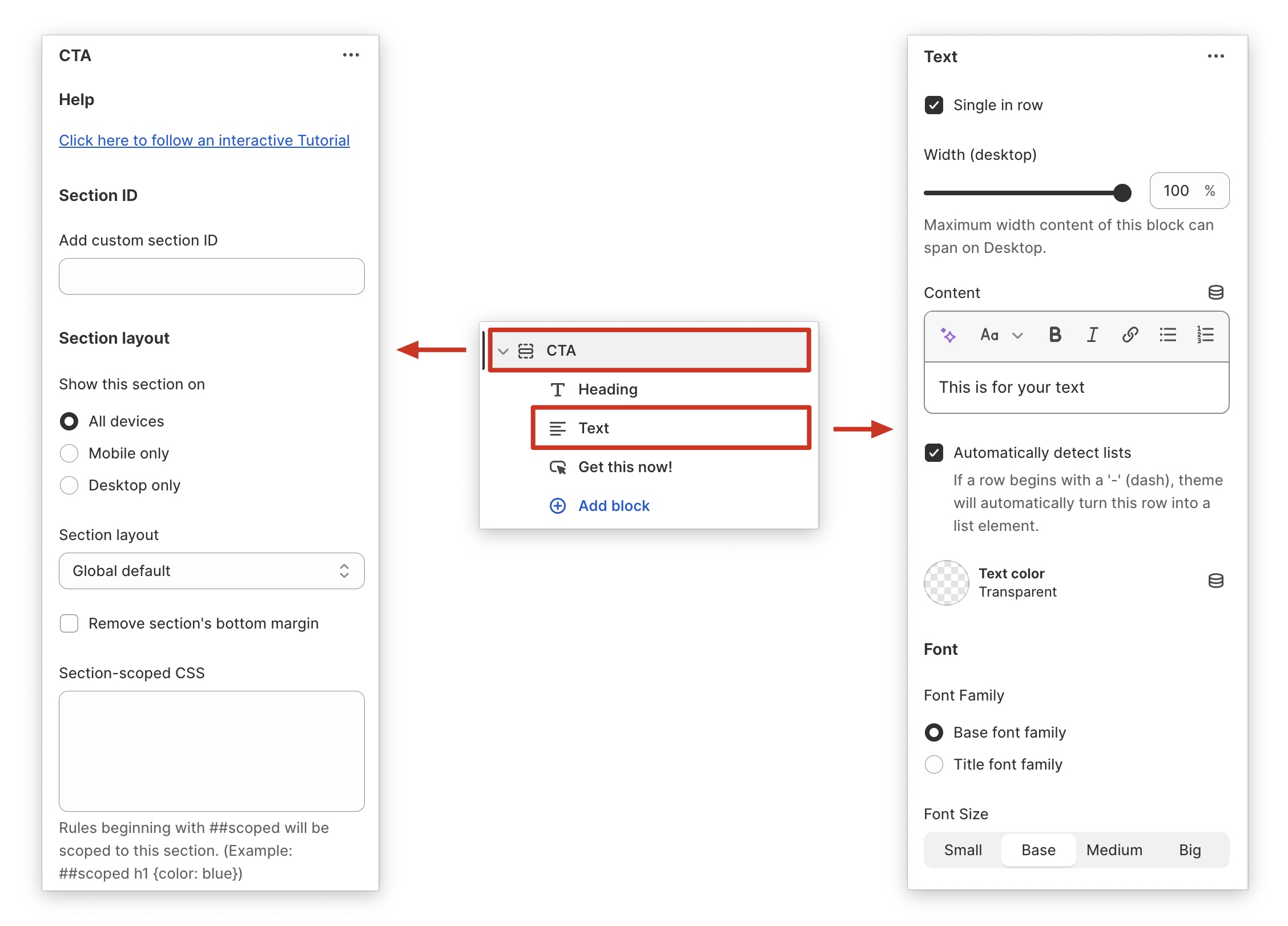
Section settings and block settings
Use section and block settings to customize your content. Add your content in the settings and customize it as needed. To access the settings, simply click the item.
The most important theme settings
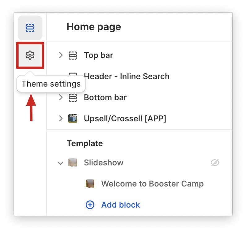
Complete your store's visual identity by following the steps 1-7.
- Branding: Upload your logo files.
- Location, Contact & Social Media: Add your social media and contact links.
- Layout: Choose a layout that reflects your store's brand and style.
- Base Colors: Select the colors that will be used throughout your store to create a cohesive look.
- Base Typography: Choose the fonts that will be used throughout your store to create a consistent brand experience.
- Buttons & Inputs: Set the default shape and style of your buttons.
- Product & Collection Cards: Choose how your products and collections will be displayed.
If you need help, click on the name of a setting to view an article with images and videos that explain the setting in more detail.
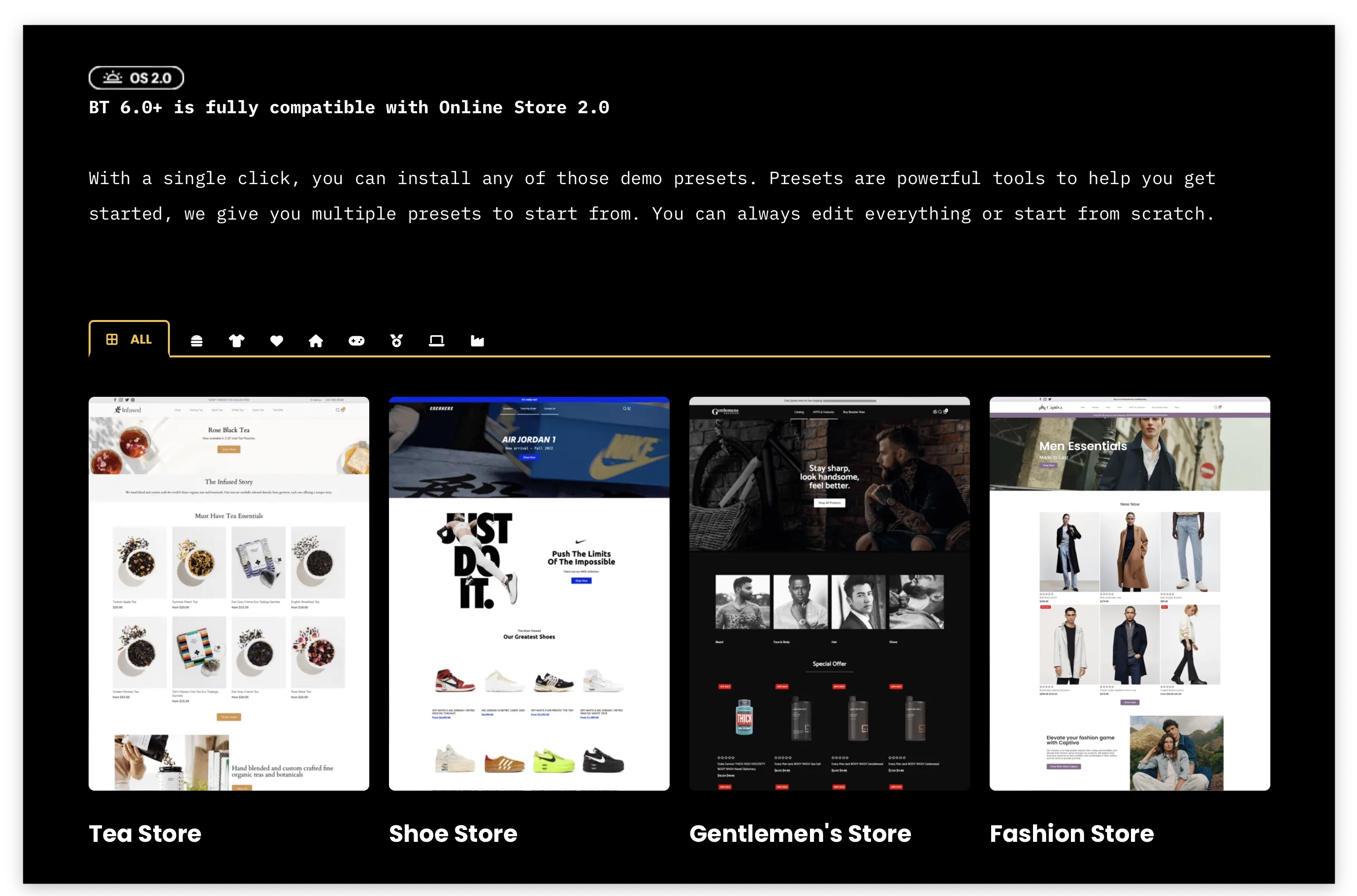
Get a Quick Start With Demos
We've created conversion-optimized demo stores that you can install directly on your Shopify store. These demos are a great way to get started with your online store design, even if you don't have any prior experience.
Once you've installed a demo, you can customize it to match your brand and products. You can change the colors, fonts, and layout, and add your own content. You can also add and remove sections and blocks to create a truly unique and engaging shopping experience for your customers.
You got the basics, it's now time to complete your design!
Now that you've added sections and blocks to a page, adjusted their settings, and started customizing your design, you've mastered the basics. But there's still so much more to learn! We have dozens of tutorials and videos on every aspect of the Booster theme, so you can continue to explore and create the perfect online store for your business. Visit our Help Center for more tutorials.