![logo_white_booster-Sep-13-2022-06-54-02-62-PM.png]](https://help.boostertheme.com/hs-fs/hubfs/logo_white_booster-Sep-13-2022-06-54-02-62-PM.png?height=36&name=logo_white_booster-Sep-13-2022-06-54-02-62-PM.png)

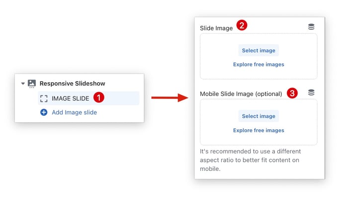
The default slideshow aspect ratio may not be ideal for both mobile and desktop devices. It is recommended to use a different aspect ratio for mobile devices to ensure that the content fits well on the screen. By using the correct aspect ratio, you can ensure that your slideshow looks good on all devices.
In this article:
Responsive and Adaptive Slideshows
The responsive slideshow and adaptive slideshow allow you to upload different images for your desktop and mobile.
If you want to always show the full height of the image, you can use the Adaptive Slideshow. This slider will adjust its height to the currently shown image.
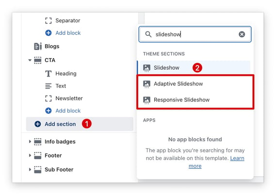
Make sure to add a separate image for mobile with a different aspect ratio.
- End of article -