Checkout Theme settings
How to edit your Checkout Page.
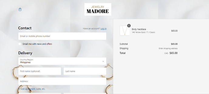
The checkout page is of prime importance in any online shopping site. After the customers buy a product, they need to pass through the checkout page to finalize the purchase. Now, let’s find out how to set up the checkout page for our Booster theme.
To access the Checkout Settings, click Customize (Themes section on Shopify) > Theme settings > Checkout.
In this article:
Banner
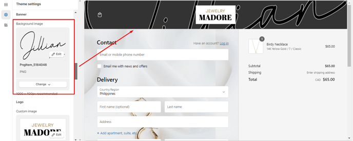
The Background Image setting will help you change the background image of your banner.
Logo
The brand logo should be present on the checkout page. The presence of the brand logo on the checkout page proves the brand’s authenticity. The three most basic settings under the logo are as follows:
- Custom Image
- Position
- Logo size
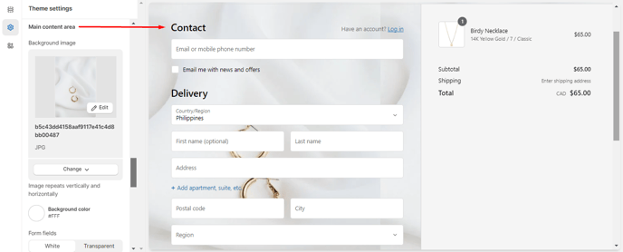
Main Content Area
The main content area of the checkout page typically displays a summary of the selected items, their prices, and quantities. It also includes fields for shipping information, payment details, and order summary. Users complete these sections to finalize their purchase.
- Background Image - You can make changes to the background image of the main content area in the Booster theme.
- Background Color - Often, you may not have a suitable background color in the Booster theme for the checkout page. In such a situation, you can use this setting to make changes to the main content page's background color.
- Form Fields - You may change the form fields to white or transparent, with the help of this setting.
Order Summary
It is natural for the customers to go through the orders on the order summary page. Hence, it is important to customize the order summary page. For that, you may need to access specific settings like
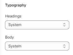
- Typography - This will help you to change the font of the headings and the body of your Checkout page.
- Colors
Accents: This setting helps you modify the color of links and highlights.
Buttons: The checkout page allows customers to use gift cards or discount vouchers while paying. The customers need to follow a few steps while making payments. This setting lets you modify the gift cards' color, discount coupons, and the subsequent steps.
Errors: This color helps you change the color of invalid field errors and messages.
Checkout Layout
You can set how many pages your customers experience when they check out.
You can choose between a one-page checkout or a three-page checkout.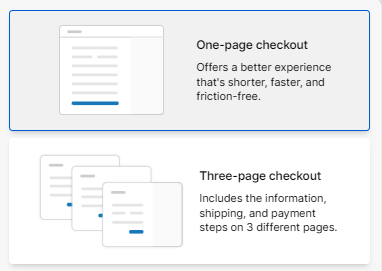
- End of article -
