![logo_white_booster-Sep-13-2022-06-54-02-62-PM.png]](https://help.boostertheme.com/hs-fs/hubfs/logo_white_booster-Sep-13-2022-06-54-02-62-PM.png?height=36&name=logo_white_booster-Sep-13-2022-06-54-02-62-PM.png)
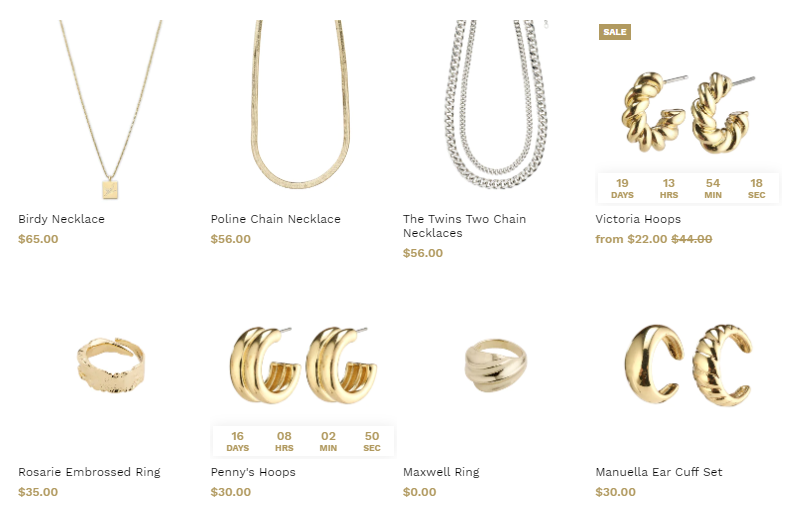
Product cards are used all over the store. You can find them in a lot of sections, on your collection page, and in the recommended section of your product page.
In this article:
Video Tutorial
Where can you find this setting?
To access the Product & Collection cards settings, go to your Theme settings > Cards, Product Cards, Collection Cards.
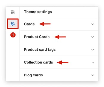
Cards theme settings
How many cards are displayed per row (Desktop/Mobile)
You can change how many cards to display in a row.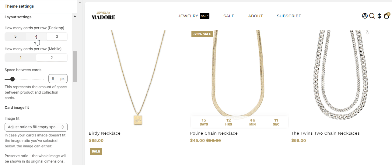
Space between Cards
This setting helps you adjust the spacing between the product cards.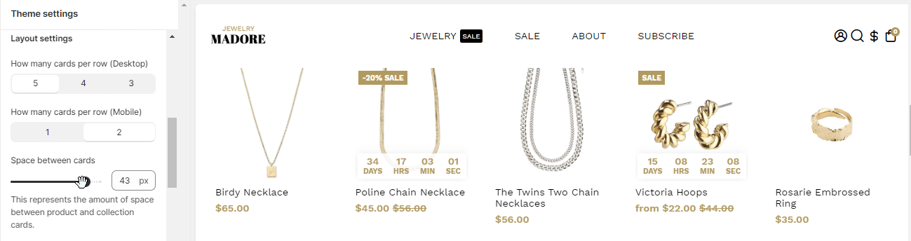
How to use Card Image Fit
We offer this setting to help you in fitting the images accurately. You may face trouble in fitting the image of your product on the card. When your image doesn't fit the available card's ratio setting, you can choose to alter your images. You are either required to:
- Preserve Ratio: We offer this setting for you to display the entire image in the dimension it initially has. However, some amount of white/space can appear on the sides of the card.
- Adjust the ratio to hide the space: If the ratio of the image doesn't match the ratio of the cards, images can be altered to fit the card ratio. The product images are then cropped and adjusted in such a way that it fits the card perfectly well, leaving no white spaces.
You can select either of the two options to fit your product images in the cards to be displayed properly, and the visitor can determine their choices.
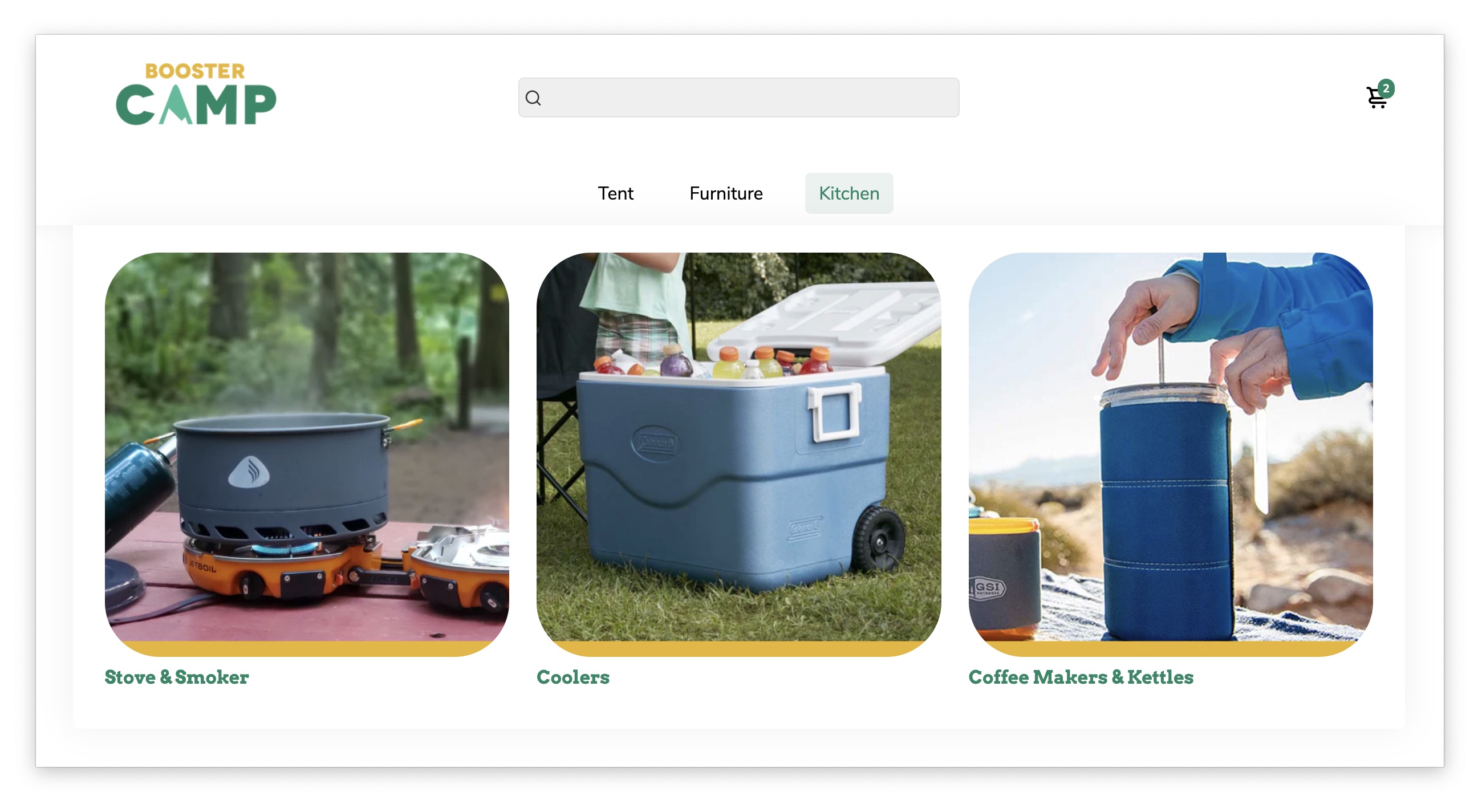
Card Image Ratio
Enjoy the freedom to personalize your cards by changing their aspect ratio. Whether you prefer a wider or taller format, you can easily customize the layout to match your desired style.

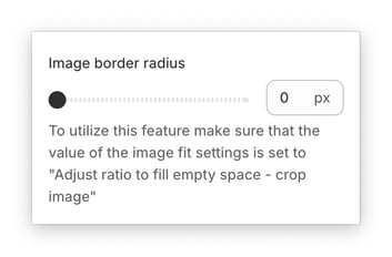
Image border radius
If you want to give your cards a more modern touch, you can add a border-radius for a touch of roundness.
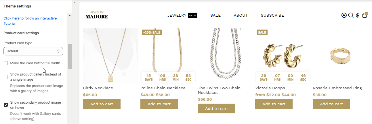
Product Cards
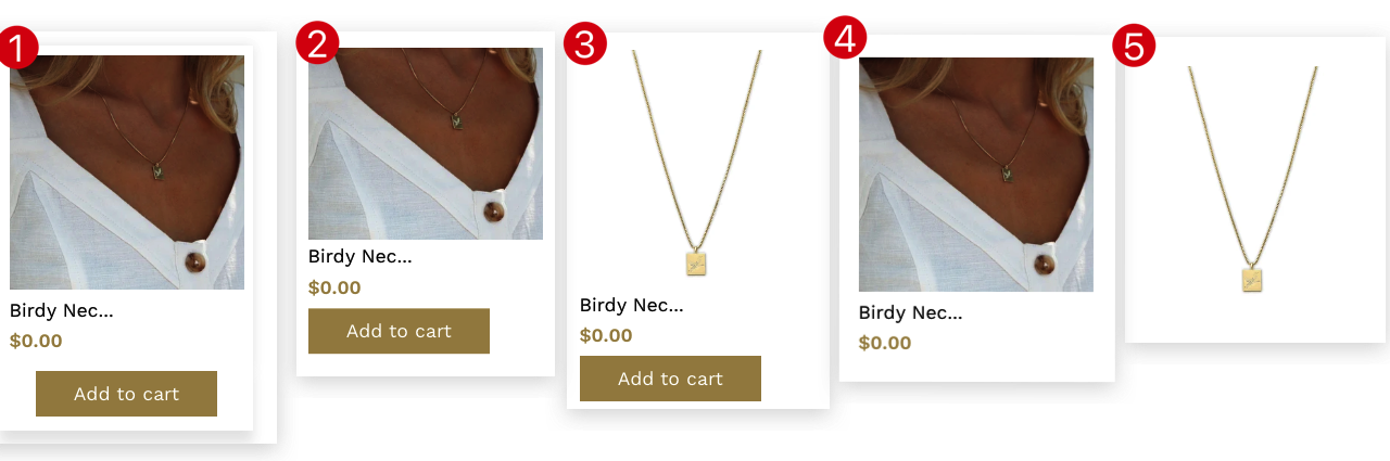
The theme provides five diverse options for the user to try different settings and check how it looks. The different options provided are: Default(1), Show the Button on Hover(2), Slide the Button on Hover(3), Hide Button(4), Catalog(5).
New update! (Booster V7)
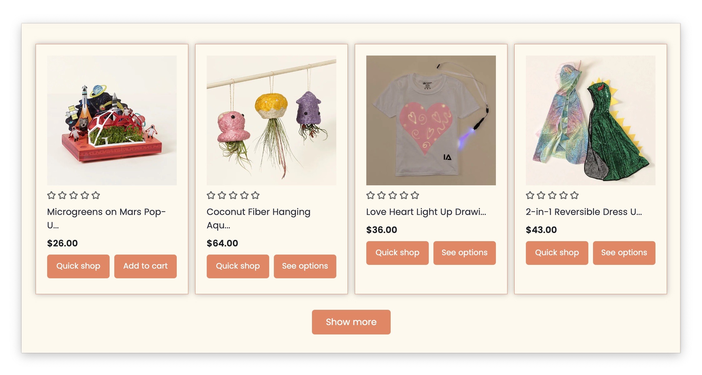
Quick Shop Button
Speed up shopping and add products to cart instantly with Booster's convenient Quick Shop Button. Located directly on the product card, this feature allows customers to quickly view product details and add items to their cart without leaving the page.

Border and Shadow
Elevate the visual appeal of your product cards by adding borders and shadows. This feature allows you to create a more defined and visually striking presentation for your products, drawing attention to it and enhancing the overall shopping experience.
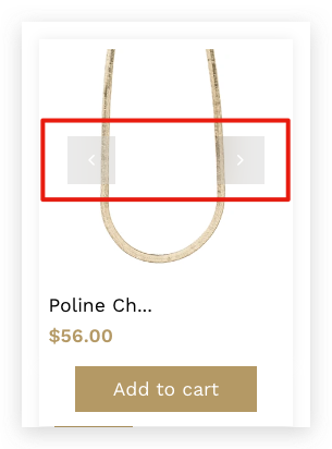
Show a product gallery instead of a single image
This setting will replace the product card image with a gallery of images, allowing the customers to navigate through the different product pictures.
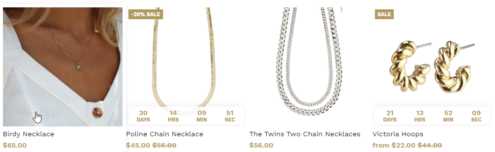
Displaying the Secondary Product Image on Hover
We offer this setting in the latest version of Booster Theme so that you can choose to display an image of the secondary product when the mouse pointer is brought over the image. The user, when placing the pointer over it, the image of the secondary product is displayed.
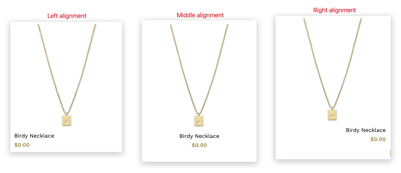
Text Alignment
With this setting, you can choose to alter the text's alignment that is placed in the store.
There are three varied options provided for the user to choose from: Left(1), Center(2), and Right(3). Choose the option that goes well with the design of your store.
Display the Brand Name of a Product
You have products listed from different brands. We provide the option of adding the brand names of the respective products. This option allows you to do so. Brand Name is displayed beneath your product's image so that the visitor while scrolling through the options, knows which brand the product belongs to. Type the brand name in the field provided.
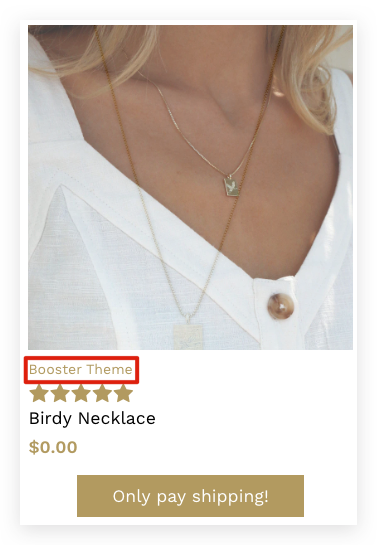
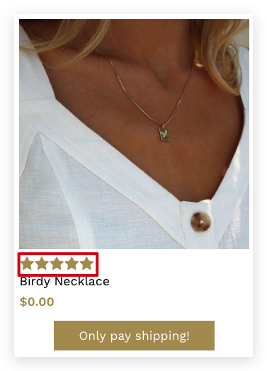
Show Review Rating Stars
Consumers often check for a review of the product to know the experience of others. This setting will display the review star rating beneath the product card.
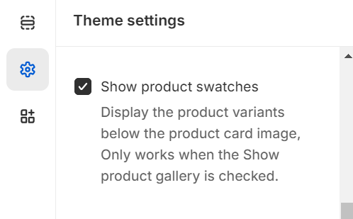
Show product swatches
This setting allows you to display the product variants below the product card image only when the Show product gallery option is enabled. By checking this option, customers will be able to see different variations of the product such as color, size, or style directly beneath the main product image.
Collection cards
With this setting, you can easily alter a collection card image you are using in your Shopify store. There are four varied options provided that help you to set one that is highly preferred. These settings will modify the collection cards on the Collection List page.
The four different options provided include Default(1), Show text inside the product card(2), Show button inside when the user hovers(3), and Hide Text(4).
- End of the article -