![logo_white_booster-Sep-13-2022-06-54-02-62-PM.png]](https://help.boostertheme.com/hs-fs/hubfs/logo_white_booster-Sep-13-2022-06-54-02-62-PM.png?height=36&name=logo_white_booster-Sep-13-2022-06-54-02-62-PM.png)
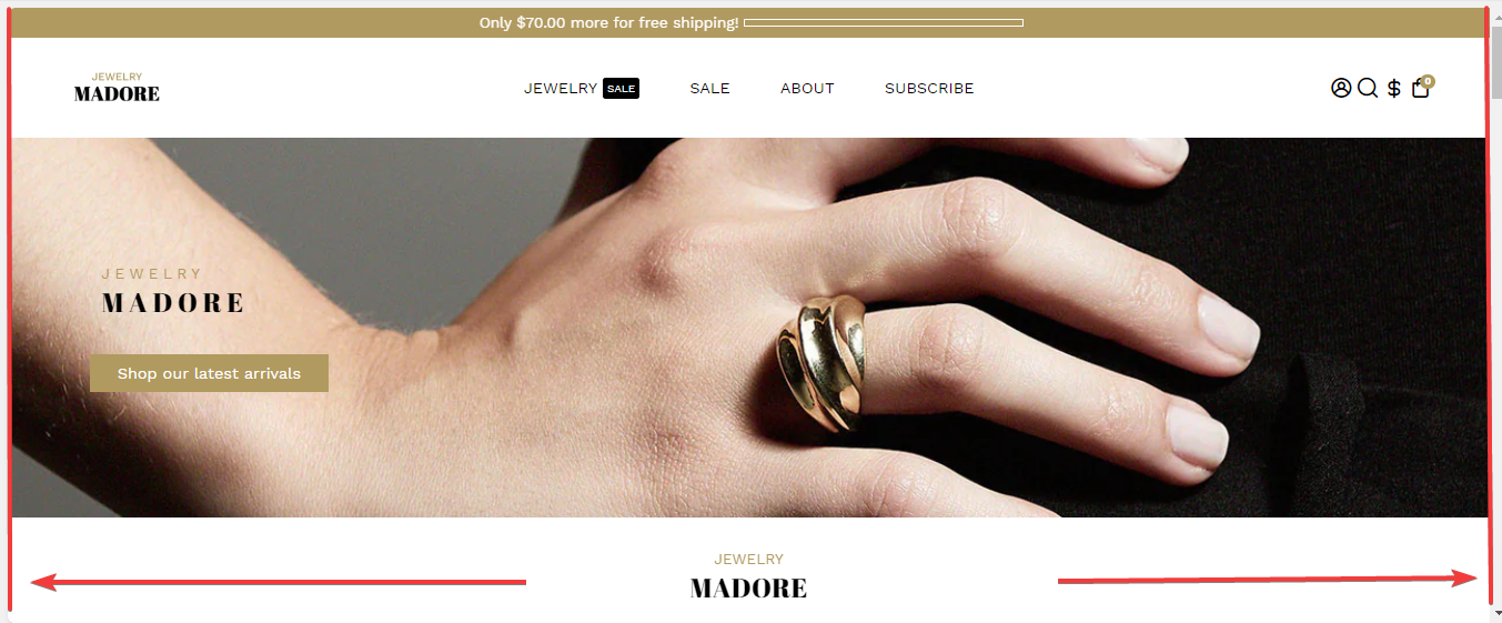
The Layout theme option is a design where you can span the entire width of your website without any side margins or padding. This layout style can be used for specific sections or pages to help you create a more immersive and impactful visual experience.
In this article:
- Where to find this feature?
- Default site layout
- Different layouts in different sections
- Maximum Website width
- Default big element
- Default small element
- Default border width
- Space between sections
Where to find this feature?
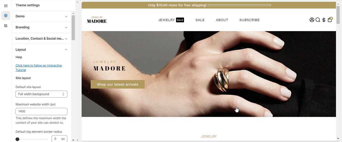
To access the Layout settings, go to your Theme settings > Layout
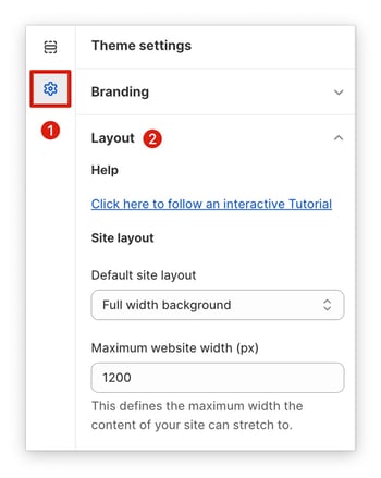
Default site layout
The default site layout is the layout that will be by default on every section of your store.
This is one of the most important settings of your Booster V5, we wanted to make a setting that would ease by a lot the process of changing the website width and layout.
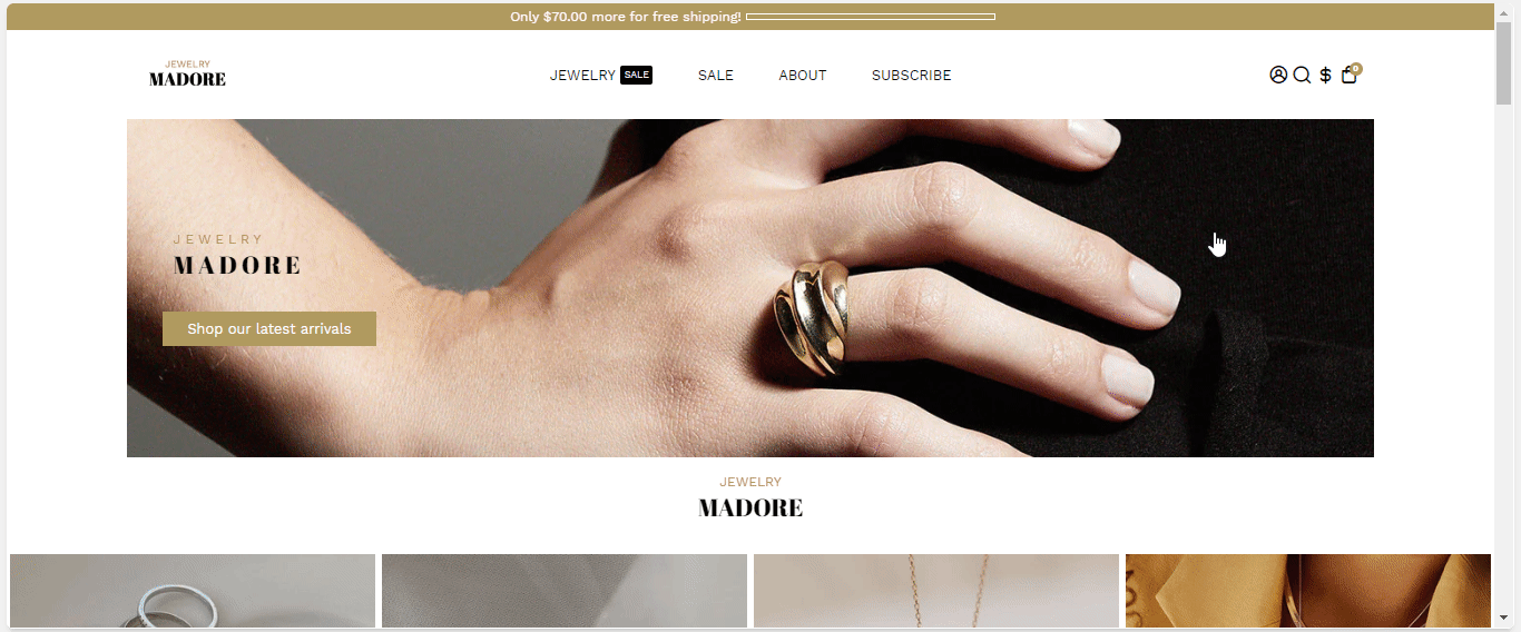
The layout of your store greatly impacts the navigation and the quality of your website.
There are 3 different possible layouts:
Boxed (1)
Full-width background (2)
Full-width (3)
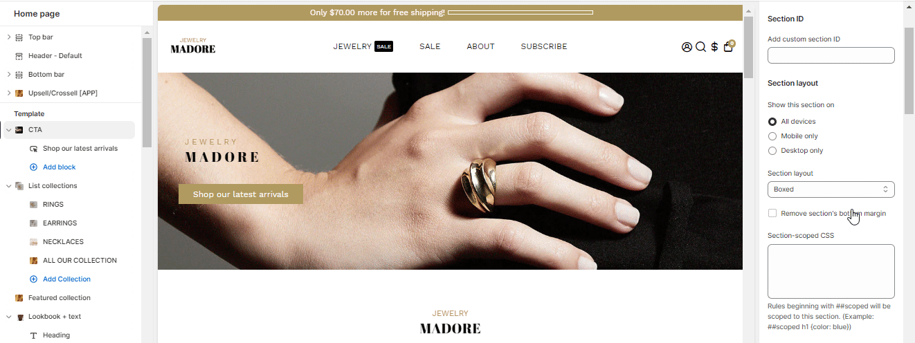
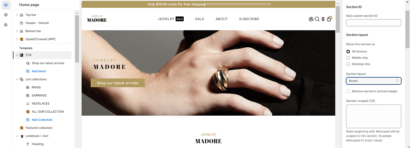
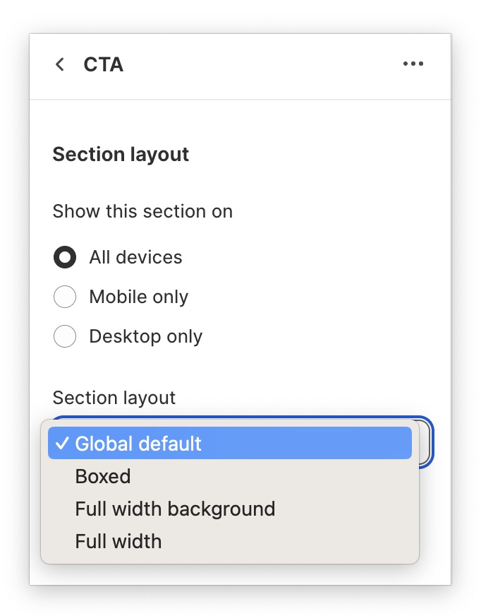
What if I don't want all sections to be the same?
No worries, we have a solution for you.
As you can see in this screenshot below, the global default is selected, meaning it will follow the layout chosen in the theme settings.
Therefore to change it from the global default, go in the section settings to « section layout » and choose another layout.
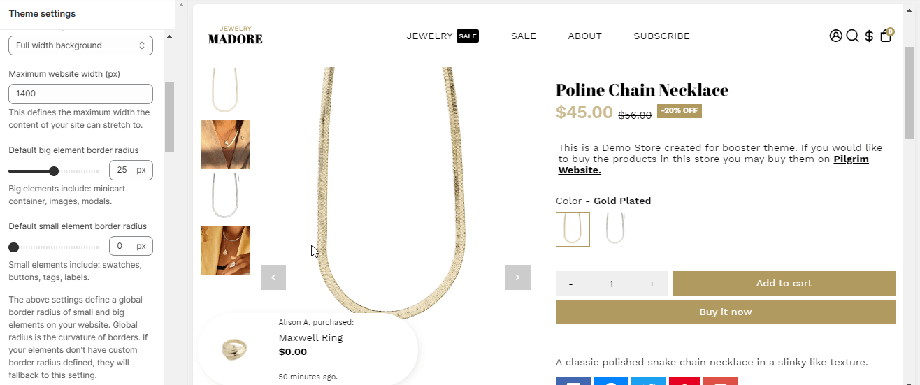
Maximum website width
Your content will extend as far as you told him to, changing this will increase the stretch of your boxed and full-width background layout.
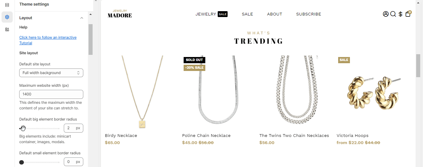
The settings down below define a global border radius of small and big elements on your website. Global radius is the curvature of borders. If your elements don't have a custom border radius defined, they will fall back to this setting.
Default big element (Minicart container, images, modals) border-radius
This will change the border-radius, which is the curvature of your elements, of your big elements. You can select from 0 px to 25 px. See the gif below for visual indications.
Default small element (Swatches, buttons, tags, labels) border-radius
This will change the border-radius, which is the curvature of your elements, of your small elements. You can select from 0 px to 25 px.
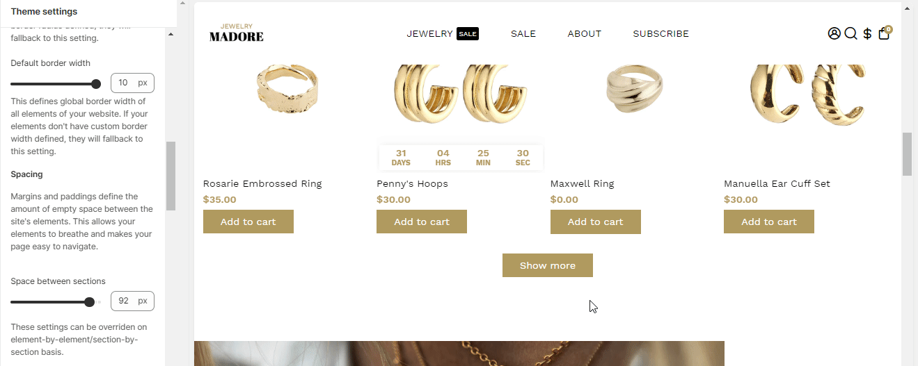
Default border width
Most of the borders on your store will have a custom setting, therefore, it is always better to choose a default one, so it looks good in case you fall back to the default border width.
Space between sections
Margins and paddings define the amount of space between the site's elements. This allows your elements to breathe and makes your page easy to navigate. You can change the space between 0 px and 100 px
- End of the article -